
Type-Only Blog Covers: When the Words Are the Image
Drop the stock photo and let big type carry the cover - the move that reads human and holds up small.

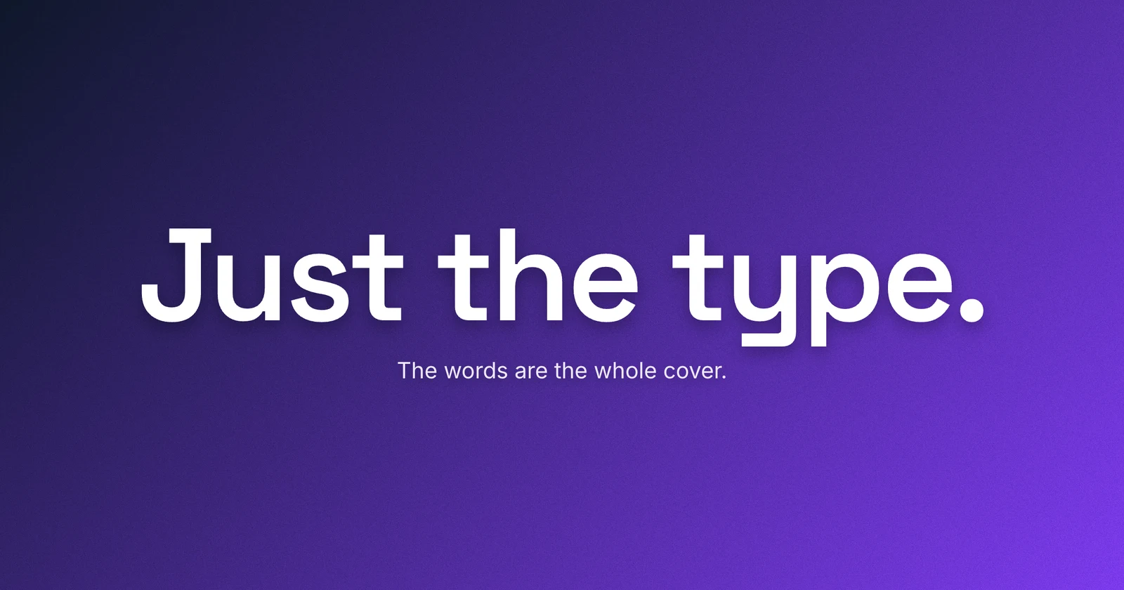
You do not need a photo. A blog cover can be nothing but type - a few heavy words on a flat color or a gradient - and in 2026 that is often the stronger call. A line of type you chose reads as something a person made, and it stays legible where a busy stock photo would shrink to mush. That is the whole case. The rest is knowing when to drop the photo, and how to make the type carry the frame on its own.
This is the third cover-type question after which single font to reach for and when to pair two. Those assume there is type on the cover and ask how to set it. This one asks the step before: whether the type should be the whole cover, with no image under it at all.
The case for losing the photo
Scroll any feed and the covers run together - the same soft-lit desk, the same abstract gradient blob, the same three-quarter laptop. They blend because they came from the same handful of stock libraries, and now from the same handful of image models. A cover that looks like every other cover has already lost its one job, which is to be picked out of a row.
A line of type is the cheap way out of that sameness. A headline set with intent - a real face, a heavy weight, a size that fills the frame - is hard to mass-produce and easy to read as a decision. Where a generated photo says someone hit a button, deliberate type says someone made a call. In a feed crowded with lookalike images, the cover that is plainly chosen is the one that stops the scroll.
It also holds up where the cover is shown small but whole - a feed tile, an archive grid, a share card. That small render is unforgiving: a photo softens until the subject is a smudge, while three heavy words stay sharp. Type-only covers are built for the tile, not the canvas - they say the same thing at 1200 pixels and at 180. The exception is Google’s Search and Discover thumbnail, which can crop as well as shrink and prefers a clean, text-light image; that trade is its own post.
When to drop the photo, and when to keep it
Type-only is a tool, not a rule. It is the right call when the words are the hook and a picture would only decorate them: opinion and essay posts, announcements, strong list or how-to titles, a brand-forward series, or any time you simply do not have a photo worth using. Forced stock is worse than no stock.
Keep the photo when the image carries an idea the words cannot. A recipe wants the dish. A travel post wants the place. A product teardown wants the product, and a photography blog is the picture by definition. There the image is the content and the type is the label - the reverse of a type-only cover.
| Reach for type-only | Keep the photo |
|---|---|
| The title is the hook (essays, opinion, lists) | The subject is the point (food, travel, product) |
| No strong, relevant image on hand | You have a real photo that adds meaning |
| A brand-forward, type-led look | A photography or visual-first blog |
| You want it razor-sharp when shown small | The image still reads when cropped small |
Make the type carry the frame
With the photo gone, the type is not on the cover - it is the cover, and it has to act like it. The common miss is timid type: a small headline parked in the middle of a big empty card, ringed by dead space, looking like a slide nobody finished. Fill the frame instead - set the title large so it dominates the card, and treat the negative space as composition rather than leftover. Keep the glyphs inside a margin, though, off the very edges, so a square thumbnail crop cannot clip the first and last words.
Keep it to the three to six words a cover can hold, in a heavy, screen-built sans. Build the hierarchy with size and weight, not a second typeface - a big bold title with a small quiet kicker beats two faces competing, and when a second face does earn its place is its own question. The background’s only job is to get out of the way: a two-stop gradient, or a flat brand color if you want it plainer, pushed to real contrast against the type so the words read first and the color reads second. Pick the palette with the care you would give a photo, because here it is the entire image.
Add grain so it reads made, not generated
A flat type cover has one failure mode, and it is the irony of the format: done carelessly, it looks generated too - the default template, clean and correct and instantly forgettable, the title slide from a deck you have already closed. The fix is texture. A fine grain or noise laid over the background breaks the perfect digital flatness that reads as rendered, and gives the cover the slightly imperfect, made-by-hand warmth that is the whole reason to go type-only in 2026.
A little does the work. Enough to feel the surface, not so much that the type loses its edges - you are after the tooth of paper or the grain of film, not static. That one layer is what separates a type cover that looks crafted from one that looks defaulted, and it is a difference a reader feels before they can name it. Lede puts a noise control on every background, flat colors included, so set your color or gradient and nudge the grain up until the flatness lifts. See grain as a finish for the full move.
A photo can be generated in a second. A line of type you chose, set to fill the frame, with a grain you tuned by eye, cannot - and that is the signal it sends.

Prove it small
Every cover gets judged at the wrong size, and type-only has the most to gain from the check, because passing it is the format’s whole advantage. Shrink the comp to about 10 percent, or step back from the screen, and read it. Heavy frame-filling type holds as a clean line where a photo would have dissolved - that is the win you came for, so confirm you actually got it.
The test also catches the two ways a type cover goes soft. Type set too small to fill the frame disappears at thumbnail size the same way a photo’s detail does. And a low-contrast title on a close background, which looked fine at full size, flattens into the color around it when shrunk. If either happens, the cover was built for the monitor, not the feed. Push the size, push the contrast, and squint again. If the type keeps coming out fuzzy even when it is big and dark, that is usually a 1x export, not a design problem.
A quick checklist
- Go type-only when the words are the hook and a photo would only decorate them.
- Keep a photo when the subject is the point - food, travel, product, photography.
- Make the title fill the frame but stay off the very edges, so a square crop can’t clip it; small type adrift in dead space reads as unfinished.
- Hold it to 3-6 heavy words; build hierarchy with size and weight, not a second face.
- Set it on a two-stop gradient (or a flat color, for a plainer look), pushed to real contrast with the type.
- Add a fine grain over the background so the cover reads made, not generated - a little, not static.
- Shrink it to a thumbnail and confirm the type still reads clean and leads.
Type-only is not the lazy cover; it is the deliberate one. No photo to hide behind means the words, the weight, the color, and the grain are all you have, and getting those four right is what makes a cover that could only be yours.
The cover for this post is type-only: three heavy words filling the frame over a gradient, with a grain tuned until the flatness lifted, and not a photo in sight. When you want to make your own, open the editor - it ships the screen-safe faces, the gradient and color backgrounds, and the noise control this post leans on, with a gallery of layouts to start from. Drop the stock photo, let the type own the frame, and add just enough grain to prove a person was here.