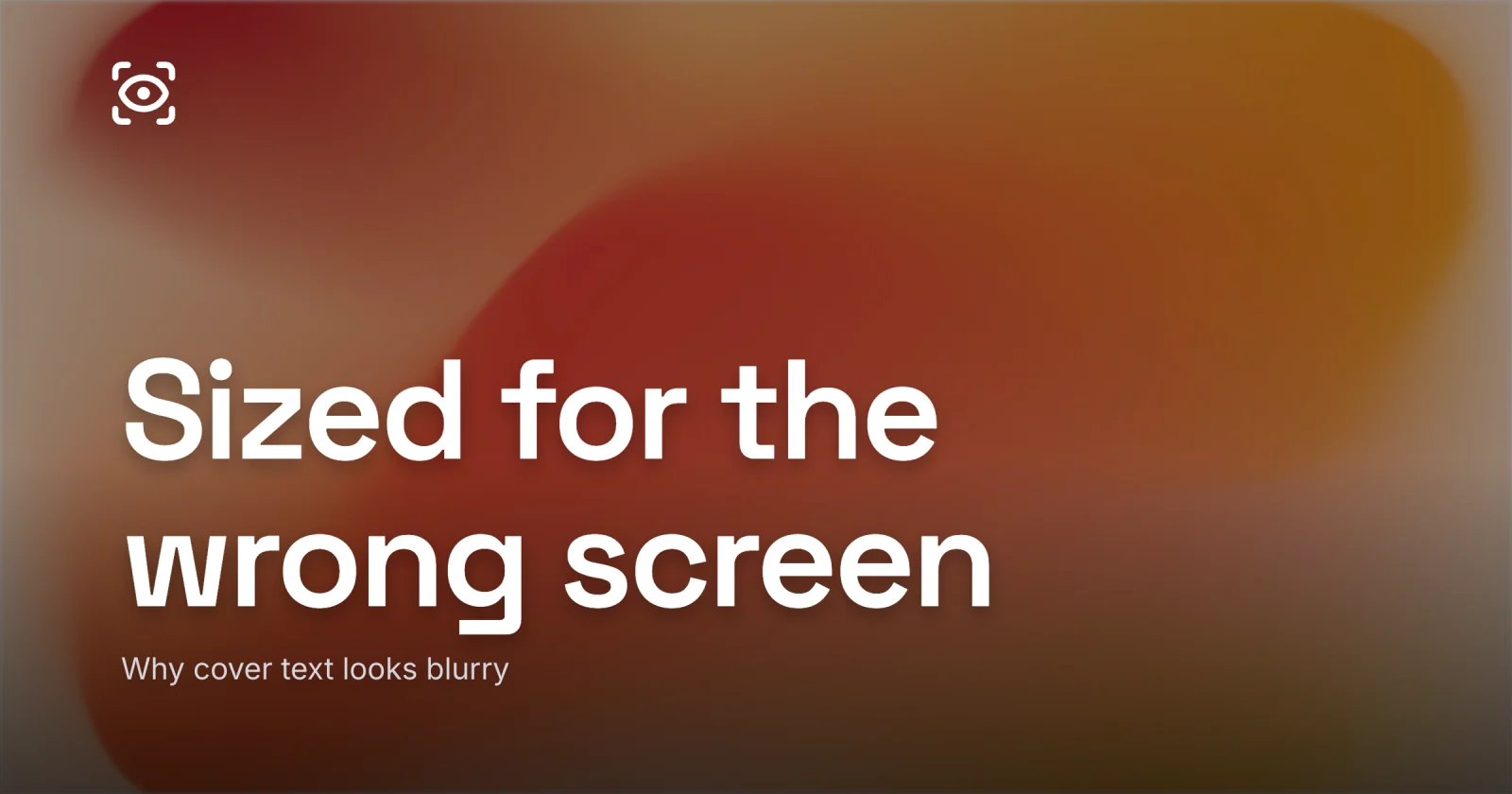
Why Your Cover Text Looks Blurry
The four real reasons cover type goes soft, and the fix for each one.
Blurry cover text is almost never the export resolution. It is thin type sized for your big monitor, plus a 1x export and a heavy recompression pass - and each of those has its own fix. That is the whole answer; the rest is how to tell which one is biting you, because the four causes look identical on screen and the wrong fix wastes an afternoon.
Here is the trap. The text looks crisp in your editor, full-width on a bright laptop. Then it lands in a feed as a 200px card, or gets pasted into Slack as a link preview, and the letters have gone soft and slightly melted. The instinct is to blame the file size and re-export at some giant resolution. Sometimes that helps. Usually it does not, because the resolution was never the problem.
The four reasons cover text goes soft
Four things make type blur on a cover, and they stack. Most soft covers are at least two of them at once.
| Cause | What it looks like | The fix |
|---|---|---|
| Thin weight at small size | Strokes fuse, letters lose their edges | Heavier weight, more letter-spacing |
| Type sized for the monitor | Title shrinks to an illegible smear in feed | Size for the thumbnail width |
| Retina export at 1x | Whole image looks soft, evenly | Export at 2x |
| Aggressive recompression | Thin strokes smear, halos around letters | Higher quality, WebP over heavy JPEG |
The first two are typography problems and they are the ones almost everyone misses. The last two are export problems, and they are the ones everyone reaches for first. Work the list top to bottom.
Thin type is the first thing to die
A hairline or light weight is the single most common cause of soft cover text, and it has nothing to do with your export settings.
A thin stroke is one or two pixels wide at full size. Shrink that cover to a feed card and the stroke drops below a pixel, so the renderer has to fake it - it spreads one pixel of ink across a pixel and a half of screen, and the crisp edge turns into a gray smudge. The thinner the font, the less there is to survive the trip down. Delicate serifs and condensed lights go first; they look elegant at 1200 pixels and disappear at 200.
The fix is weight. Set the title in a bold or heavier cut, and the strokes carry enough ink to stay solid when they shrink. Add a touch of letter-spacing so the glyphs do not fuse into each other when the image gets recompressed small. This is the same discipline behind choosing fonts that stay legible at thumbnail size - weight is the lever, and on a cover you almost always want more of it than feels right on the big screen.
Type sized for the monitor instead of the feed
The second typography mistake is sizing the title to look good full-width, then letting the feed shrink it to nothing.
You design at 1280 pixels wide on a 27-inch monitor. A 40px title looks generous there. But the cover does not live at 1280; it lives at maybe 180px wide in a phone feed, and your 40px title is now about 6px tall. No font is sharp at 6px. It is not blurry so much as gone.
Size the title for the small render. In a 1280×720 design, the headline doing real work is roughly 60px type, sometimes more. Keep the word count low - three to six words, two lines at most - so the type has room to be genuinely large. The squint test settles it: shrink the design to about ten percent, or back away from the screen, and if the title is not still readable, it is too small. That single check catches the sizing blur every time.


Retina export at 1x makes everything soft
Now the export problems. If the whole image looks soft and evenly so, with the photo as fuzzy as the type, you are looking at a retina export at 1x.
A high-DPI screen softens a cover exported at exactly its display width, evenly, photo and type alike. That flat, all-over softness is the tell that separates it from the selective smearing of a thin font or a bad recompression pass.
The fix is one rule: export at 2x the slot the image fills. The mechanism behind that rule - devicePixelRatio, which screens double, the exact pixel math for a hero versus a feed card - lives in exporting a retina-sharp cover, and it is worth reading if your covers ship soft even with bold type. But note the order: 2x fixes retina softness and only retina softness. It will not rescue a hairline font, and it will not undo a bad compression pass.
Recompression eats the thinnest strokes
The last cause is the sneakiest, because it happens after you export. Your cover looks sharp when you save it, then a platform re-encodes it on upload and the thin strokes come back smeared.
Lossy compression works by throwing away detail it judges you will not miss, and the hard edge of a letter against a busy photo is exactly the high-contrast detail it spends its budget on first. Push the quality too low, or hand a platform a heavy JPEG and let it recompress, and you get halos and fuzz around every glyph - worst on the thin ones, which had the least edge to spare.
Two moves keep the text crisp through the upload. Save as WebP, which holds sharp edges at a smaller size than JPEG and gives the platform less reason to recompress aggressively. And keep the quality high enough that the strokes survive - a quality around 80 to 86 lands a sharp card well under 150 KB. The format trade-offs, and why WebP beats a heavy JPEG for type over photos, are laid out in WebP vs JPG vs PNG for blog images. The short version: thin text and lossy JPEG do not get along.
Work the causes in order
Run the four in sequence and you will catch the real one without guessing.
- Set the title in a bold or heavier weight with a little extra letter-spacing.
- Size it for the thumbnail, not the monitor; shrink to ten percent and confirm it still reads.
- Export at 2x so retina screens get real pixels instead of a stretch.
- Save as WebP at a quality around 80-86 so recompression does not smear the strokes.
The reason re-exporting at a bigger size so rarely works is that it only touches one of these, and usually not the one that is biting you. Thin type sized for the big screen is the quiet culprit on most soft covers, and no resolution bump will fix a font that was never going to survive the shrink. It is the same lesson behind what makes a good blog featured image: design for the smallest place the cover lands. Get the weight and the size right first, then let the 2x export and WebP carry it the rest of the way.
The cover for this post was made in Lede, with one heavy title sized for the small render and exported as a 2x WebP so the type stays sharp wherever it lands. When you want to make yours, open the editor, or start from a layout in the gallery and just swap the words. Pick a bold weight, size it for the feed, and ship it at double.