Choosing Fonts for Blog Covers
Type that still reads at thumbnail size - heavy weight, a screen sans, sized small, one display face.
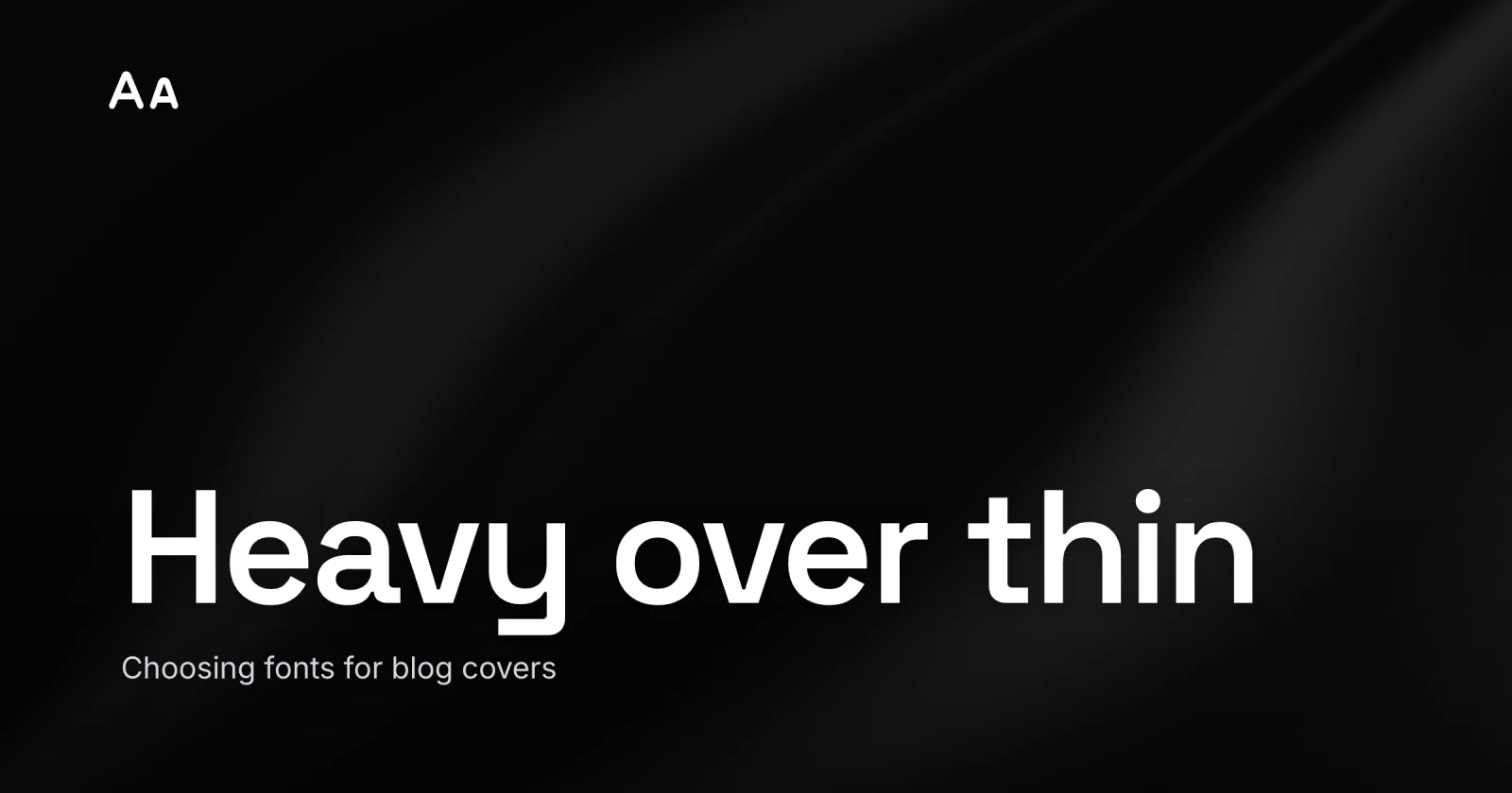
A blog cover lives or dies on one question that has nothing to do with taste: can you still read the title when the image is the size of a feed tile? The best fonts for blog covers are the ones that survive the shrink - a heavy weight, a plain sans built for screens, sized for the small render, and exactly one display face doing the loud work. That is the whole answer. The rest is why each of those four choices is the difference between a cover that gets read and one that turns to gray fuzz.
Cover typography gets chosen on a big monitor, where everything looks elegant, and then met on a phone, where elegant is the first casualty. Over 90 percent of social and feed traffic happens on a phone held at arm’s length, in bad light, while the reader is half paying attention. Your type has to win that fight on the phone, the one your 27-inch display never shows you.
Heavy weight is not optional
Reach for Bold or Black, and keep your floor well above Regular and Light. This is the single change that fixes more cover text than any font swap.
Here is the mechanical reason. A cover is exported, downscaled, and recompressed - usually to WebP or JPEG, both of which convert the image to a luminance-plus-color model, subsample the color, and quantize fine detail to save bytes. Thin strokes are exactly that kind of high-frequency detail, so they smear first. A hairline that looks crisp at full size gets smeared into the background by the time the feed renders it at phone-feed scale, around 180px. A heavy stroke has the mass to survive.
Thin weights that look refined on desktop collapse into noise at mobile scale; medium-to-bold weights read reliably across devices and lighting. So set your floor at Semi-Bold and reach for Bold or Black on the title. One caution: the very heaviest weights can close up their own letter shapes at small sizes, so a clean Bold often beats an ultra-Black that fuses into a blob. Test it small.


Sans over serif, almost always
Pick a sans for the title and you have already avoided the most common cover-type mistake.
The legibility research surprises people: studies find no reliable reading-speed difference from serifs alone. Serifs are not the problem in themselves. The problem is what most pretty serifs carry with them - high stroke contrast, those gorgeous thick-to-hairline transitions that read as luxury at 1200px and as broken letters at 180px. Compression eats the hairlines. The word falls apart.
A sans sidesteps the whole risk. And not just any sans: the ones drawn for screens win. Inter was designed for screen UI at small sizes, with a tall x-height and open letter shapes that stay legible when the cover is rendered tiny. Roboto, Montserrat, and old reliable Helvetica Bold all hold up. If you want a serif for personality, use it as a heavy display serif with thick slabs, where the strokes are beefy enough to survive the trip down.
Size for the small render, where the cover ends up
Set the type for where the cover is smallest, then let the big version take care of itself. This is the same rule as designing the whole featured image for the thumbnail, applied to type specifically.
The math is friendly. A phone feed shows your cover at roughly 180px wide. For the title to read there, it has to be genuinely large in the source file: in a 1200×630 design, a title around 60-90px tall does the work. That feels enormous while you are editing on a monitor. It is correct.
Word count is the other half of size. The cover holds the hook, not the headline - three to six words, two lines at most. If a title is forcing you to shrink the type to fit, the fix is fewer words while the letters stay big. The moment a cover runs to a third line, it has quietly become a paragraph nobody will read.
One display face, one workhorse
Two typefaces are the ceiling for a cover, and most covers are better with one. The job split is simple: a display face carries the title, a quiet sans handles anything secondary - a kicker, a date, a byline.
The rule that makes a pairing work is contrast with a shared spine. Pick two faces that differ clearly in personality but sit at a similar x-height, so they feel related rather than random. A bold geometric display over a neutral sans is a combination that almost never misses. What kills covers is the font drawer: three faces, two of them mid-weight, all fighting. Restraint reads as design. A pile of fonts reads as a ransom note.
Here is the whole decision in one pass:
| Cover role | Reach for | Avoid |
|---|---|---|
| The title | heavy sans (Inter, Roboto, Montserrat) Bold/Black | Light/Regular weights, fine serifs |
| A display moment | one bold display face, thick strokes | a second loud face competing |
| Kicker / byline | the same sans, smaller, Medium | a third typeface |
| A high-contrast serif | only if strokes are thick enough small | delicate text serifs, hairlines |
The mistake: choosing type at full size
The error underneath almost every unreadable cover is judging the font on the monitor it was made on. At 1200px, a thin elegant serif with airy letter-spacing looks like a magazine. The designer signs off. Then the post ships, the feed renders it at 180px, and the title is a smudge.
Flip the order. Choose the font small. Shrink the comp to about 10 percent or squint at it from across the room while you are still deciding on a typeface, before you commit. If the title still holds together as shapes, the font survives. If the letters fuse or fade, no amount of elegance saves it - pick a heavier weight or a sturdier face and check again. Legibility is the requirement taste has to fit inside, the thing it earns its place around.
A quick checklist
Before the cover ships, run the type past this:
- Title in Bold or Black, never Light or Regular.
- A screen-built sans for the title - Inter, Roboto, Montserrat, Helvetica Bold.
- Any serif is a heavy display serif, thick strokes only.
- Title sized 60-90px in a 1200×630 file, big enough to read at 180px.
- Three to six words, two lines at most.
- One display face, one workhorse - no third typeface.
- Shrink to ~10 percent and confirm every letter still reads.
None of this needs a type degree. Heavy over thin, sans over fancy, sized small, one face over five - then a squint test to prove it. Get those four right and your title earns its read in the feed instead of dissolving into the background. And if the cover still looks off after all that, the culprit is usually the spacing, not the font - tracking and line height are their own quick fix.
The cover for this post was built in Lede with exactly those rules: one heavy sans, sized for the small render, nothing competing. When you want to set your own, open Lede - the editor ships the screen-safe fonts, presets for every cover size, and a gallery of layouts to start from. For the full step-by-step build, follow that walkthrough, then shrink it to 10 percent and see if the title still holds.