How to Make a Blog Cover Image
A handful of rules and about four minutes, no design background required.
Open a browser tab, set the canvas to 1200×630, put one background and a short title on it, check the contrast, and export. That is how you make a blog cover image - free, in the browser, no design skills. That is the whole answer; the rest is the craft that separates a cover that earns a click from a gray smudge in the feed.
The reason the question persists is that most blog cover makers hand you a blank canvas and a thousand fonts and call it done. The hard part was never the tool. It is knowing the four or five decisions that make a featured image read when it shrinks to a thumbnail, which is where almost every reader meets it first.
Start at the right size
Set the canvas to 1200×630 pixels before you touch anything else. It is a 1.91:1 ratio, the Open Graph size Facebook standardized and every other link unfurler matched to stay compatible. One file at that size renders cleanly on Facebook, LinkedIn, Slack, and Discord.
X is the one to watch.
It crops your image from the center to its own card shape
and falls back to your og:image when no separate Twitter image is set. So keep the title and any logo away from the
far edges. If a blog cover maker gives you a preset, pick OG / Social 1200×630 and skip the math. More on the why
in what size a blog cover image should be.
Pick one background, and make it earn its place
A cover carries one idea, so it gets one background. Three honest choices:
| Background | Best for | The catch |
|---|---|---|
| A photo | posts with a clear subject (a place, a product, a face) | needs a scrim before text will read over it |
| A flat or gradient color | opinion pieces, announcements, anything abstract | leans hard on the type to carry the whole cover |
| A subtle texture or pattern | series art, brand-consistent sets | goes busy fast; keep contrast low behind text |
If you reach for a photo, use one with a quiet patch where the title will sit. A free blog cover maker that pulls Unsplash in by URL saves you the download-reupload dance. One subject, one background. A cover with two competing focal points reads as none.
Add the title, and keep it short
Type the hook, not the headline. Three to six words, two lines at most. A cover holds the line that makes someone stop; the full title lives in the post.
Set it in a heavy weight and a plain sans. Thin weights and delicate serifs are the first thing to die on the way down to a feed card, where the image gets recompressed to a few hundred pixels wide. Size it big - genuinely big, the kind of size that looks almost too large on your monitor. At the scale a phone feed gives you, almost-too-large is about right. If you want to go deeper on the craft, what makes a good blog featured image is the companion to this post.
Fix the contrast before anything else
This is the step people skip, and it is the one that decides whether the title is readable. White text dropped raw over a photo will vanish the moment the photo goes light behind a letter.
Do not flatten the whole image with a 50 percent black wash; it turns your photo to gray mud. Reach for a gradient scrim instead: black at around 40 percent fading to transparent, sitting only under the text. Then prove it with two checks:
- Tune to the worst pixel. Find the lightest patch under your darkest letter and make that single spot pass the contrast bar.
- Check it in grayscale. Strip the color out. If the title still stands out, the contrast is structural and survives bright sun and color-blind readers. If it disappears, you were leaning on a color trick.
The bar is WCAG AA: 4.5:1 for normal text and 3:1 for large text, where large is roughly 24px or 18.66px bold. A cover headline is large text. Large does not buy you out of the rule.
Export small and sharp
Save it as WebP if your blog cover maker offers it. Google’s own study puts WebP at 25-34% smaller than JPEG at the same quality, and a cover is one of the heaviest things on the page, so the saving is real. PNG is for flat graphics with hard edges; JPEG is the safe fallback when WebP is not on the table.
Export at 2x if you can - a 2400×1260 file scaled into a 1200-wide slot stays crisp on a retina screen instead of going soft. Aim to land the file under about 150 KB. A cover that loads slowly is a cover the reader scrolls past before it paints.
“It only looks blurry because it is too small” is backwards
Here is the one most people get wrong. When a cover looks soft, the reflex is to assume the export was low quality. It is almost always the opposite: the file is fine, the type was just sized for the full-width hero and not the thumbnail.
Design for the smallest place the image appears, and every larger size takes care of itself.
Shrink your finished cover to about 10 percent, or squint at it from across the room. If the subject and title still read, you have a cover. If they blur into one shape, the fix is in the design: the title is too small or the contrast is too soft, and a sharper export will not save it. This single test kills more bad covers than any rule I know.


A quick checklist
- Canvas set to 1200×630, title and logo kept off the edges.
- One background, one subject.
- Title in a heavy weight, three to six words, sized large.
- Gradient scrim under the text, tuned to the worst pixel.
- Checked in grayscale; the title still stands out.
- Exported as WebP, 2x, under ~150 KB.
- Squinted at it small and it still reads.
None of this needs a design degree or a paid app. A free blog cover maker, the right size, one subject, real contrast, and a squint to check it small - that is the whole job, and it gets faster every time you do it.
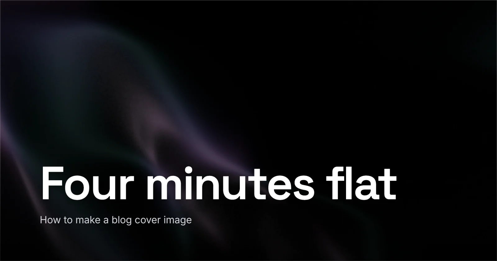
The cover on this post was made in Lede in about four minutes, start to export. When you want to make yours, open Lede - presets for every size, a one-click 2x WebP export, no watermark - or start from a layout in the gallery and just swap the words. Your first one takes a few minutes; your tenth takes one.