What Makes a Good Blog Featured Image
The handful of decisions that make or break a cover, and why most of them fall apart the moment it shrinks to a thumbnail.
Most advice on featured images stops at “use a high-quality, relevant image,” and on its own that has never once helped me make a cover that actually earned a click. The ones that work all do the same unglamorous thing: they still read when they are the size of a thumbnail.
Design for the smallest place the image appears - the mobile feed, the archive grid - not the full-width version on your screen. That is the whole answer. The rest is just defending that one rule: a clear subject, contrast you can prove, and type heavy enough to survive the shrink.


It is harder than it sounds, because one file does several jobs at several sizes and almost nobody sees it big first. It shows up as a 200px tile in a feed, a square crop on your homepage, a link card pasted into a group chat. A design that looks balanced at 1200 pixels wide can turn to mush at 280.
The cover has to win in four places at once
Your featured image is one file rendered in at least four contexts, each cropping and scaling it differently:
| Where it shows up | Typical render | What breaks first |
|---|---|---|
| Mobile feed / archive grid | ~150-320px wide | small text, fine detail |
| Homepage thumbnail | square-ish crop | off-center subject, edge text |
| Social / link preview | 1200×630, 1.91:1 | cropped logos, letterboxing |
| In-article hero | full width, 16:9 | little - this is the easy one |
Design for the top row; the social card and hero are forgiving by comparison. The mobile thumbnail is the smallest render and the harshest crop, so let it set the rules. If you are unsure where to start, the size each render expects is worth pinning down first.
Design for the thumbnail first
Here is the one test I run on every cover before it ships: shrink it to about 10 percent, or squint at it from across the room. If the subject and the title still read, you have something. If they blur together, simplify, because you are looking at how most people will actually meet the image.
This test kills more bad covers than any rule I know. Detail that earns its place at full size becomes noise at 200px: a third element, a busy texture, a second line of small print. Cut until what is left survives the squint.
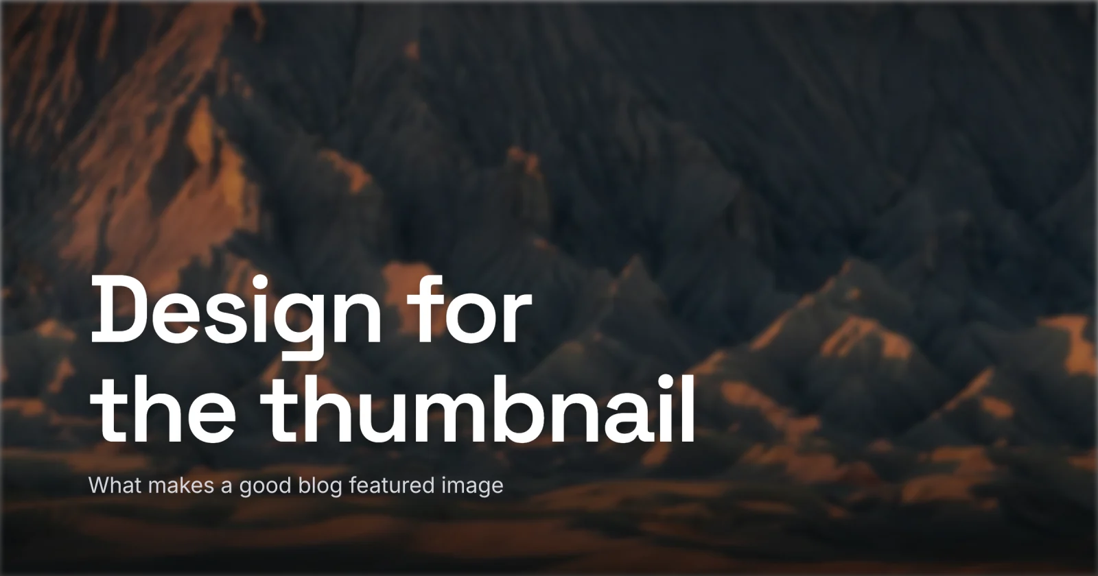
One subject, and somewhere quiet for the title
A cover carries one idea. Pick the single thing a reader should register - a face, a product shot, the headline itself - and make it dominant. A reader can hold one strong subject and one supporting element at feed scale; add a third and the image starts to read as cluttered. Pile on more and it reads as none.
Faces pull focus harder than any gradient, so if a person belongs on the cover, let them anchor it. And leave room. Empty space is the low-variance patch you are holding for the title - the one area you can guarantee stays readable.
Treat the cover like a road sign. If it only works when someone stops to study it, it has already lost the person scrolling past.
Get the contrast right with a gradient scrim
The reflex is to drop a flat 50 percent black layer over the whole photo so the white text shows up. It works, and it flattens your photo into gray mud in the process.
Reach for a gradient scrim instead: black at around 40 percent fading to transparent, sitting only under the text. It buys back the contrast a busy photo steals while leaving the rest of the image bright. On the rare cover that does want a flat overlay, you seldom have to push past about 50 percent to carry white text safely.
Two checks keep you honest:
- Tune to the worst pixel. A photo is many colors, so a contrast checker can only ever call it “maybe.” Find the lightest patch sitting under your darkest letter and make that spot pass.
- Convert the whole comp to grayscale. If the title still stands out with the color stripped out, the contrast is structural. If it disappears, you were leaning on a color difference that fails for the roughly one in twelve men with a color-vision deficiency, and often for everyone else in bright sun on a phone. The full method for keeping text readable over a photo goes deeper than these two checks.
The bar to clear is WCAG AA: 4.5:1 for normal text and 3:1 for large text, which is about 24px, or 19px bold. A cover headline is large text. Large does not mean exempt.
Type that survives the shrink
Thin weights and delicate serifs are the first thing to die on the way down to a feed card. Use a heavy weight, a plain sans, and a touch of extra letter-spacing so the glyphs do not fuse when the image is recompressed small.
Size the type for the small render. At the ~180px width a phone feed gives you, the title has to be genuinely large - in a 1280×720 design, that is roughly 60px-tall type doing the work. Keep the word count low: three to six words, two lines at most. A cover holds the hook alone. The moment a title runs to a third line, it has stopped being a cover and become a paragraph.
Make it a set
The blogs whose covers you recognize all run a system: one or two typefaces, a tight palette, the logo in the same corner every time. A reader should clock that a post is yours before they reach the byline.
Consistency is also the cheapest speed-up there is. Once a layout works, the next cover is just a swap of the title and the subject on top of it. In Lede that swap is the whole job; the layout, fonts, and logo spot stay locked in the template. That is the line between covers being a chore and being a five-minute step.
A quick checklist
- Shrink the design to ~10 percent and confirm the subject and title still read.
- Keep to one subject, and cut anything competing with it.
- Use a gradient scrim under the text instead of a full wash, and tune it to the worst pixel there.
- Check the comp in grayscale; the title should still stand out.
- Set the title in a heavy weight, three to six words, two lines at most.
- Reuse the same fonts, colors, and logo spot as your other covers.
None of this needs a designer or a spare hour. One subject, room and real contrast for the title, a heavy weight, and a quick squint to check it small. Get those right and the cover earns its click in the feed instead of getting scrolled past as a gray smudge.
When you want to make one step by step, open Lede - it has presets for every size, a gallery of templates to start from, and a one-click 2x WebP export. Build one, shrink it to a thumbnail, and ship it only if it still reads.