How to Keep Your Blog Covers Consistent
Build the system once, then every cover is a five-minute swap.
I spent my first year of blogging designing every cover from scratch, and the feed looked exactly like that: twelve posts, twelve unrelated pictures, no thread running through any of them. The fix was not better taste. It was a system.
Consistent blog covers come from running a small set of fixed rules - one or two typefaces, a tight palette, a logo in the same spot - built once as a template you reuse for every cover. That is the whole answer. The rest is which rules to lock, and why a reader’s eye rewards you for locking them.
This matters because of speed - the reader’s and yours. People decide whether a feed is worth their attention in milliseconds; one study clocked a first aesthetic impression at about 50 ms, and MIT found the brain can register a whole image in as little as 13 ms. Your cover gets recognized or skipped in less time than a blink. Branded featured images win that blink by looking familiar before anything is read.
Why a system beats one-off art
The payoff compounds. A brand that shows up the same way every time gets recognized and trusted faster, which is the head start a cover is supposed to buy you. Most people know that and still do not pull it off, because they treat every cover as a fresh creative decision.


A reader scrolling your archive should clock that a post is yours before they read the title. That recognition is the entire payoff. When three covers in a row share a typeface, a color, and a logo position, the fourth one reads as part of a series, and a series feels like a publication. A grab-bag of stock photos feels like a folder.
There is a selfish reason too. A system is the cheapest speed-up in blogging. Once the frame is set, a new cover is just a quick swap.
Lock these five things, leave the rest free
A blog cover style guide does not need to be a 40-page brand book. It needs five decisions, made once and written down somewhere you will actually look:
- Typefaces - one or two. A display face for the title, a plain sans for any supporting line. That pairing handles almost every cover you will ever make.
- Palette - three to four colors. One or two brand colors, a near-black, and a near-white for type. A palette this tight forces every cover to relate.
- Logo - one fixed spot. Same corner, same size, every time. The top-left or bottom-right works; just pick one and never move it.
- Type placement - a fixed zone. Title always bottom-left, or always centered. The reader’s eye learns where to look.
- Treatment - one background style. Full-bleed photo with a scrim, or a flat brand color, or a gradient. Pick a lane.
Everything outside those five is yours to change per post: the photo, the accent color within the palette, the actual words. That is the trick - the fixed parts carry the brand, the free parts carry the topic.
Fixed versus free: where consistency lives
The mistake is locking the wrong things. People freeze their photo style and let their fonts drift, which is backwards. Type and layout are what the eye reads as “brand”; the subject is what reads as “this specific post.” Hold the first, vary the second.
| Element | Lock it (brand) | Vary it (post) |
|---|---|---|
| Typefaces | always the same one or two | - |
| Logo position | always the same corner | - |
| Type placement | always the same zone | - |
| Palette | the same 3-4 colors | which accent leads |
| Background | the same treatment style | the actual photo or shade |
| Title text | - | every post |
Read the table top to bottom: much of what a reader registers in that first glance lives in the locked column. You change very little per post and still get a unique cover, because the title and subject do the differentiating for you.
It is a system, not a stencil
The fear I hear most is that consistency means monotony - that locking the layout makes every cover identical and boring. It does the opposite, if you set it up right.
Identical and consistent are different things. Identical is the same photo treatment, same crop, same flat color on every post; that reads as a template nobody bothered to fill in. Consistent is a shared frame with genuinely different content inside it: a portrait one week, a flat teal card the next, a wide landscape after that, all wearing the same type and the same logo in the same place. They read as clear siblings while staying distinct from one another. The constraint is what makes the variation legible - because the frame never moves, the eye is free to notice what changed.
If your covers feel samey, the answer is rarely “loosen the rules.” It is usually that you locked a variable thing (the picture) and left a brand thing (the font) loose. Flip it.
Build it once, then swap
Here is the part that turns this from theory into a five-minute habit. Once you have the five decisions, build them into a single reusable template - the fonts, palette, logo, and type zone all set. Save it. Now publishing a cover is three moves: drop in the new photo or color, type the new title, export. The brand parts never move because you never touch them.
This is also where the craft rules from what makes a good blog featured image keep paying off. Your locked type weight and your locked scrim mean every cover passes the shrink-to-a-thumbnail test by default, every time. You solved readability once, inside the template, and every future cover inherits it.
A quick checklist
Before you call your cover system done, confirm:
- You picked one or two typefaces and nothing else gets used.
- Your palette is three to four colors, written down.
- The logo sits in one fixed corner, same size, every cover.
- The title lives in one fixed zone across every post.
- You chose one background treatment and stuck to it.
- You saved the whole thing as a reusable template, so the next cover is a quick swap instead of a redraw.
Lay three of your recent covers side by side. If a stranger can tell they are from the same blog with the titles covered up, the system is working. If they look like three different blogs, you locked the wrong things.
A consistent feed is not about having the best individual cover. It is about the fourth post looking like it belongs with the first three, made in a fraction of the time. Set the rules once and the recognition compounds on its own.
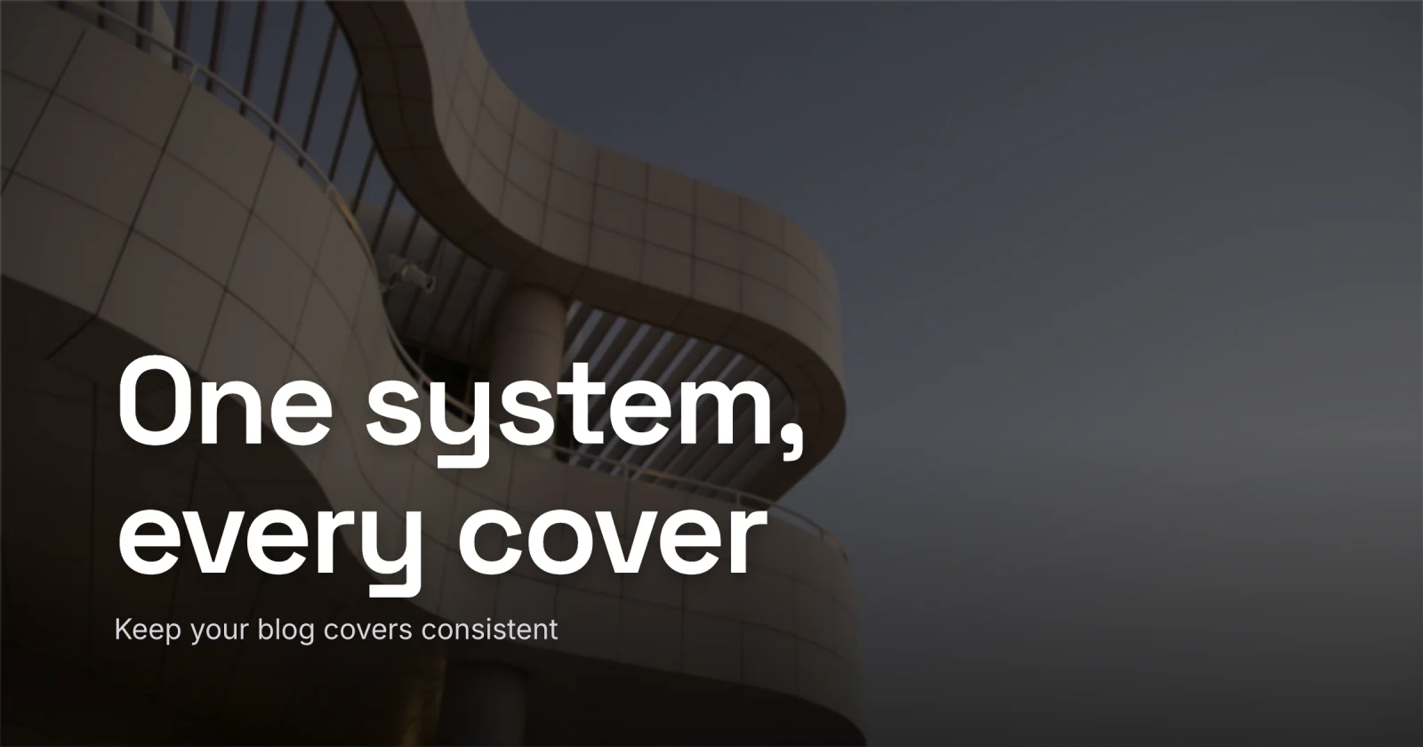
I built the cover for this post in Lede off a saved template - same fonts, same logo spot, new title. When you want to set up your own, open Lede, start from a layout in the gallery, and save it as the frame you reuse for every post after. Lock the frame once, and every cover after it is already half-built.