Color Palettes for On-Brand Blog Covers
Three or four colors, one accent, and enough contrast for white type.
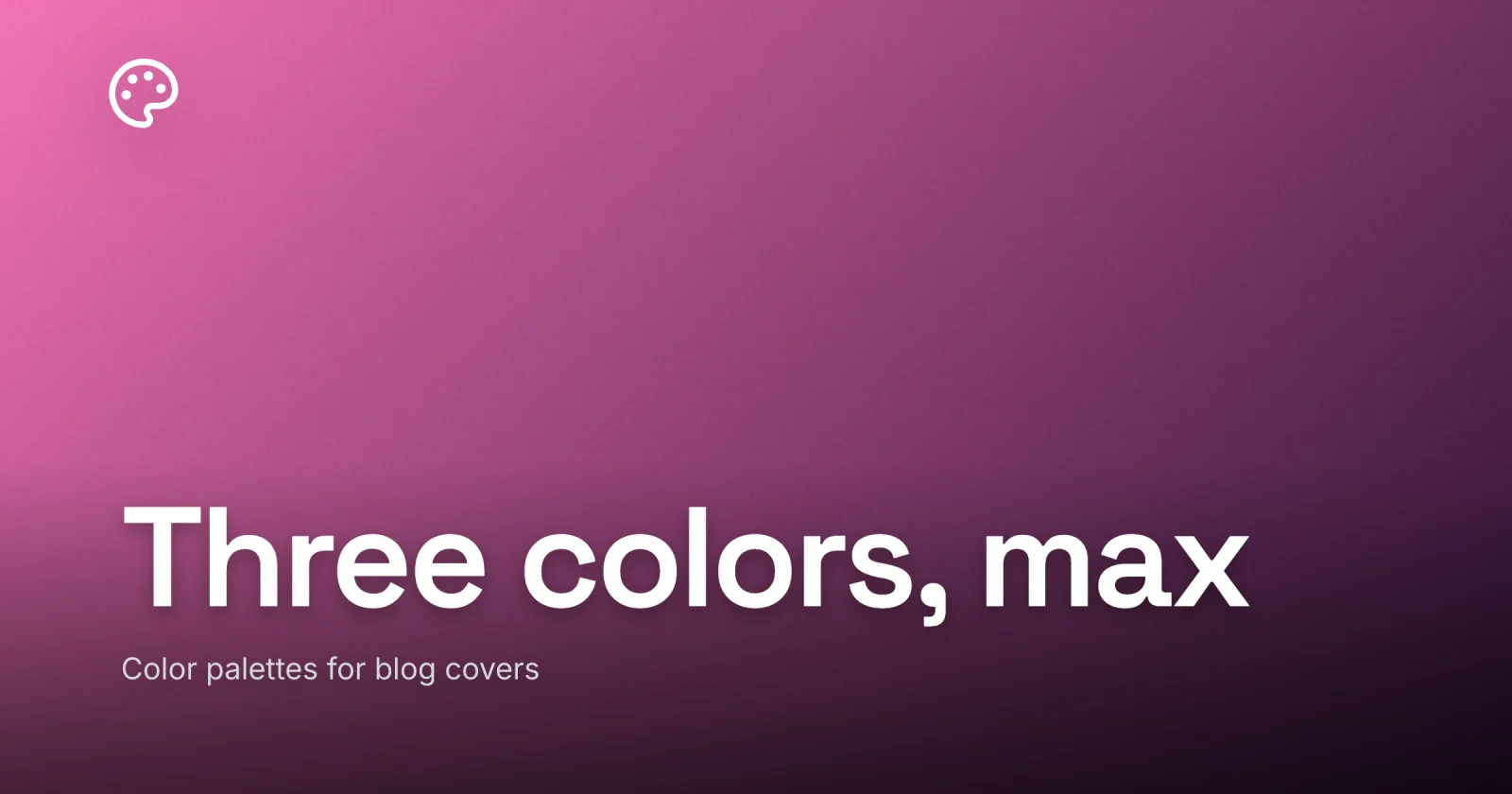
A cover palette is three or four colors: one or two brand colors, a near-black, and a near-white for type. The only hard rule is that whatever color carries your text has to clear contrast against the color behind it - everything else is taste. That is the whole answer. The rest is which colors to pick, where each one goes, and why a tight set beats a free hand every time.
I learned this the slow way. My early covers each had their own little color mood, and lined up in a feed they looked like a ransom note. The fix was not a better eye. It was cutting the number of colors I let myself use down to four and refusing to add a fifth.
Four colors, and a job for each
A working cover palette is small and assigned. Every color has one role, and you do not reach past the set:
- One or two brand colors. The hues a reader should start to associate with you. One is plenty; two gives you a little range without drifting.
- A near-black. Not pure
#000, which looks like a hole - something like#16161aor a very dark version of your brand color. It anchors type, dark backgrounds, and any scrim. - A near-white. Again, rarely pure
#fff. A warm off-white (#faf7f2) or a cool one (#f4f6f8) for light text and open space. It softens the contrast just enough to stop the cover looking like a spreadsheet.
That is four slots. Brand, brand, dark, light. A reader’s eye learns a set that small within a few posts, and the recognition is the entire point of having a palette at all. Locking the palette into a reusable system is what turns these four colors from a one-off choice into the thing that makes your feed read as one publication.

Warm or cool: pick a side and stay there
Color carries a mood before a single word is read, and the fastest way to set that mood is the warm-cool axis.
Warm palettes lean on reds, oranges, and yellows: clay, amber, terracotta, brick. They read friendly, energetic, a little loud. Cool palettes lean on blues, greens, and violets: ink, slate, teal, sage. They read calm, considered, a little serious. Neither is correct. A cooking blog and a fintech newsletter want different temperatures, and both are right.
The choice that actually matters is consistency. A feed where one cover is warm terracotta and the next is cool slate looks like two blogs sharing a wall. Decide which side of the line your brand sits on, and let every cover lean that way. You can vary the exact hue post to post - a deeper clay one week, a softer amber the next - as long as the temperature holds. On covers that lead with a photo instead of flat color, that same warm-or-cool call moves to the grade, not the palette - the palette fixes your colors, the grade pushes the photo’s light to the same side of the line.
The accent: one loud color, used almost nowhere
An accent is the color that breaks the calm. It is how you point a reader at the one thing on the cover you most want them to see, and it only works if you are stingy with it.
Spend the accent on the smallest possible area: a category tag, a thin underline beneath the title, a single highlighted word, the dot on an i. The instant it covers more than a sliver of the canvas, it stops being an accent and becomes a second brand color fighting the first. Rare is the whole mechanism.
To pick one, look across the color wheel from your main brand color. A blue brand takes a warm accent - amber, coral. A green brand takes a red-pink. The gap between them on the wheel is what makes the accent jump off the cover. If opposites feel too loud for your taste, step one notch in: a near-complement still pops without shouting.
The one rule that is not optional: text contrast
Everything above is taste. This part is not. Whatever color your title is set in has to clear a real contrast threshold against the color directly behind it, or the cover fails at the only job it has. A cover that reads at thumbnail size lives or dies on this, because color contrast is the first thing a small render strips away.
The bar is WCAG AA: 4.5:1 for normal text and 3:1 for large text, where large is roughly 24px or 19px bold. A cover headline is large text, so 3:1 is your floor. Clear it comfortably and aim higher, because a floor is the worst you are allowed to ship.
This is where most palettes quietly break. Two colors can look great side by side in a swatch and still leave white type unreadable on one of them. A mid-tone clay, a soft sage, a pastel anything - these are exactly the colors that look lovely and carry white text at maybe 2:1. So the palette decision and the text-color decision are the same decision. When you choose your brand color, you are also choosing whether your type goes white or near-black on top of it.
A quick way to sort your own palette:
| Background color | White text | Near-black text |
|---|---|---|
| Deep ink / navy | clears easily | fails |
| Mid clay / rust | borderline, check it | clears |
| Soft sage / pastel | fails | clears easily |
| Near-black | clears easily | fails |
| Near-white | fails | clears easily |
Read it as a pairing guide: dark backgrounds want white type, light and mid backgrounds want near-black. That is why the near-black and near-white earn their slots in the palette - they are your two text colors, and one of them will pass on any background you pick. When the title sits over a photo rather than a flat color, the contrast math gets harder, and keeping text readable over a photo covers the scrim-and-grayscale method for proving it holds.

A small palette is a feature, not a limit
The worry I hear is that four colors will feel starved, that real design needs a fuller box. It is backwards. A loose palette is what makes covers look amateur, because nothing relates and the eye finds no pattern to lock onto.
Constraint is what does the branding. When the colors never change, a reader stops seeing individual covers and starts seeing a brand, the same way you know a soda can by its red from across a shop. The discipline is the look. If your covers feel flat or repetitive, the answer is almost never a fifth color - it is a sharper accent, a better photo, or more contrast between the dark and light you already have.
You also get speed. A fixed palette is one fewer thing to decide on every cover, which is the difference between a cover taking five minutes and taking an afternoon of nudging hex codes.
A quick checklist
- Cap the palette at three or four colors: one or two brand, a near-black, a near-white.
- Pick warm or cool and keep every cover on that side.
- Choose one accent and use it on the smallest area on the cover.
- Set near-black to something like
#16161aand keep near-white a touch off pure white, so both stay a step in from the extremes. - Confirm your title color clears 3:1 against every background you use, and treat that as the floor.
- Write the four hex codes down so the next cover reuses them instead of re-guessing.
Get those right and your covers stop looking like a folder of unrelated pictures and start looking like a brand, in a fraction of the design time.
I built the cover for this post in Lede off a four-color palette - one brand clay, a near-black, an off-white, and a single ink-blue accent on one word. When you want to set your own, open Lede, pull a starting layout from the gallery, and lock the four colors into it. Choose them once, and every cover after inherits the look for free.