Color Grading Your Blog Cover - Tone and Contrast
Warm or cool, flat or punchy - grade the photo so the cover holds.
A cover is graded well when its temperature is consistent shot to shot and its contrast survives the small render. Grading fixes a photo’s mood - it does not replace a palette. That is the whole answer; the rest is why, and where each lever actually pushes.
Two different jobs hide under the word “color.” A palette is which colors you choose: the hex for your headline, the one accent, the brand. Grading is how you treat the photo you already have - its shadows, its white balance, its contrast - so the thing carries a mood and matches the rest of your feed. The palette labels. The grade sets. Same image, two halves of the same problem, and most covers only solve one of them - part of what separates a cover that works from one that gets scrolled past.


Temperature: warm or cool, and the Kelvin intuition
Warm or cool is the fastest mood lever you have, and it works before a single word is read. The convention is backwards. Lower color temperatures read warm. Higher ones read cool. An incandescent bulb sits around 2400 K and glows yellow-orange; photographic daylight lands near 5500 K; the open sky climbs higher and goes blue. Wikipedia puts the line at over 5000 K being “cool colors” and 2700-3000 K being “warm colors”, which is the exact opposite of the physics but matches how the eye reads it.
You are not correcting the photo back to neutral. You are setting a deliberate cast. Warming a cover pushes the white balance toward amber - friendly, editorial, lived-in. Cooling it pushes toward blue - calm, clinical, considered. Pick the cast on purpose. A cover with no cast at all reads as a stock photo nobody touched.
Tonal contrast: shadows, midtones, highlights
Every photo splits into three zones: shadows (the dark end), midtones (the middle), and highlights (the bright end). The standard move to give a flat image punch is an S-curve - drop the shadows, lift the highlights, leave the midtones anchored. That single adjustment is what separates a photo that looks shot from one that looks scanned.
It matters for a cover because of what sits on top of the photo: type. Contrast is the difference in luminance or color that makes an object distinguishable from a background. A white headline needs a value gap between its edge and the pixels under it. A flat, low-contrast photo gives it nothing - everything is bunched near the midpoint, so the type’s edge has nothing to push against. And human vision is more sensitive to relative differences than to absolute luminance, which is the technical reason a flat midtone photo reads as gray mush at thumbnail size while looking “fine” at full width.
The fix is the same discipline the house already preaches for flat color, applied to tone. Grade the region behind your title to a value the headline can clear, then confirm it. Keeping text readable over a photo walks the worst-pixel method and the grayscale test - run both against the graded image, not the raw one.
Saturation: pull it down a notch
One stance, stated flat: pull the saturation slightly down so the type and the single accent stay the loudest things on the cover. A fully saturated photo fights your headline. Every loud color in the frame competes for the same attention you want on six words and one accent dot.
Saturation is a separate axis from the contrast above. It is the colorfulness of an area judged in proportion to its brightness, which means you can dial it down without flattening the tonal range you just built with the S-curve. Desaturate the photo a touch and it recedes into a backdrop. Keep the accent at full strength and it pops against the quieter field. Loud type, quiet photo. That is the order of operations.
Consistency: grade every cover toward one temperature
Here is the move that turns grading from a per-post fiddle into a brand decision. Pick one temperature - warm or cool - and grade every cover toward it. The feed then reads as one publication instead of a pile of unrelated images, the same way a fixed palette holds a brand together. This is the half of color a palette handles from the other side: the palette pins your hex codes, the grade pins your light.
A feed where one cover is golden-warm and the next is steel-blue looks like two blogs sharing a wall. You feel it before you can name it. Grade every photo toward that one temperature and build each cover on the same Lede layout, which is how a consistent cover system actually holds up past the third post.
An ungraded cover is not neutral. It is just untouched.
Pick the mood, grade backward into it
Four common grades, and what each one feels like - so you can pick the feeling first and work the sliders back from it:
| Look | Temperature | Contrast | Mood it reads as |
|---|---|---|---|
| Editorial | warm | high | energetic, alive |
| Considered | cool | low | calm, premium |
| Technical | neutral | high | clean, precise |
| Nostalgic | warm | low | soft, wistful |
Read it backward when you are stuck: decide the mood, then the temperature and contrast tell you which sliders to move.
A washed-out photo is a grading problem, not a brightness one
The reflex, when a photo looks pale and lifeless, is to drag the brightness up. It is the wrong slider. Brightness lifts every tone by the same amount, so your already-bright areas blow out to featureless white while the midtones stay just as muddy. The photo gets paler, not better.
The actual fix is contrast plus temperature, and the grade follows the type, not the other way around. If your title is white, grade the region behind it darker and cooler so the headline clears it. If your title is near-black, grade that region lighter. You are not grading the whole photo to taste. You are grading the patch under the words to a value the words can survive, then carrying that same temperature across the rest of the frame.
A quick checklist
- Pick one temperature for the whole feed - warm (toward ~3000 K amber) or cool (toward ~6500 K blue) - and grade every cover toward it.
- Add an S-curve so the photo has real shadow-to-highlight contrast, not a flat midtone mush.
- Pull saturation down a notch so the type and accent stay the loudest things on the cover.
- Grade the behind-the-title region darker and cooler for white type, lighter for near-black type.
- Run the grayscale test to confirm the contrast is structural, not a hue trick that vanishes at thumbnail size.
- Keep the cast deliberate, never auto-neutral.
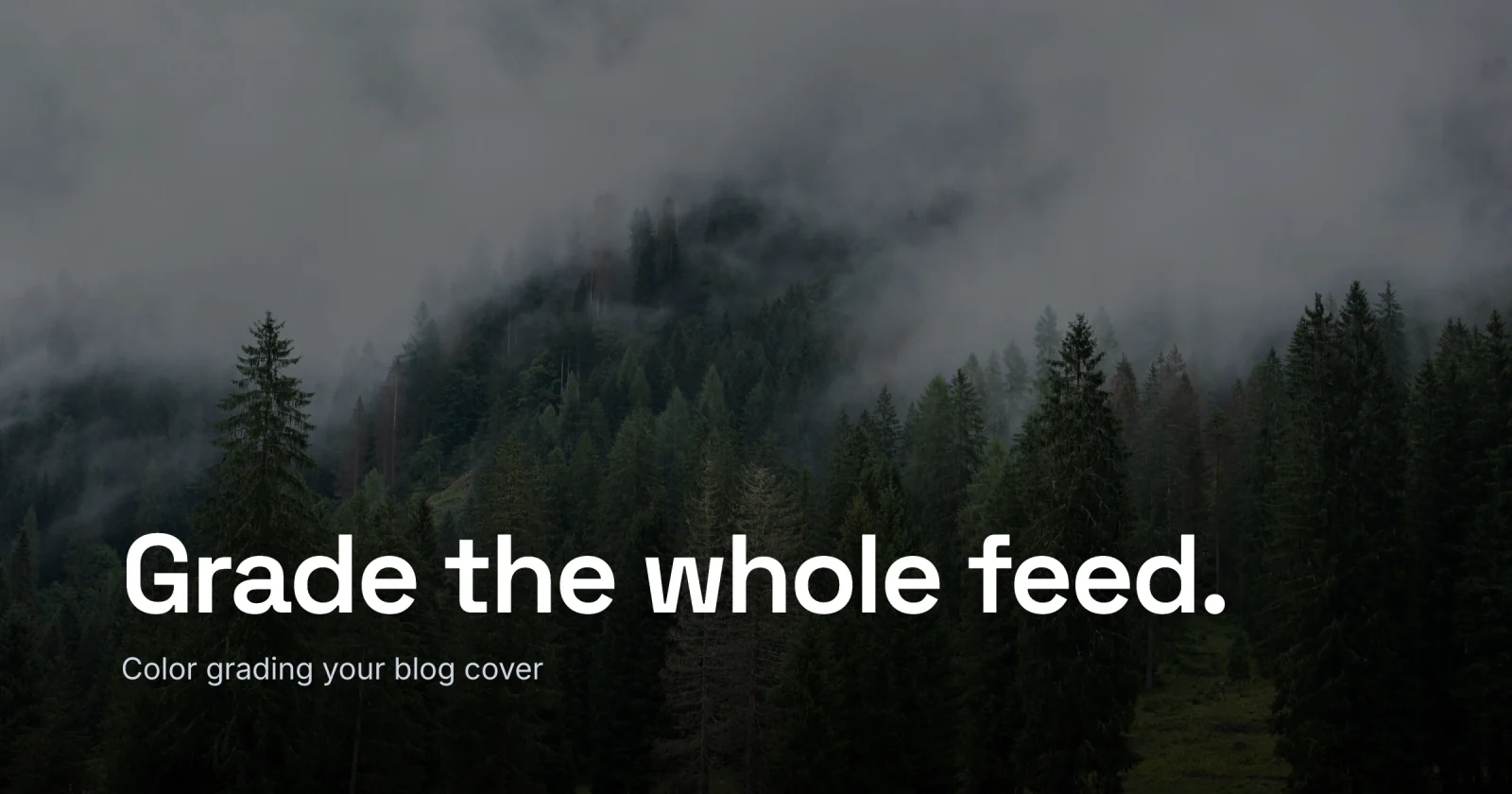
The cover for this post is a cool, misty forest - I built it in Lede by darkening the band behind the headline until the white type was the loudest thing in the frame, no filter on the photo itself. You can do the same: grade your photo to one temperature in your photo editor, then open the editor, drop it in, and darken the band until the title clears it. Start from the gallery if you want a layout to copy. Pick the mood first, then grade backward into it.