
It's Not Always the Font, It's the Spacing
You swapped the typeface three times and the cover still looks off. The culprit is usually the spacing - most fonts ship tuned for body text, not for type this big.

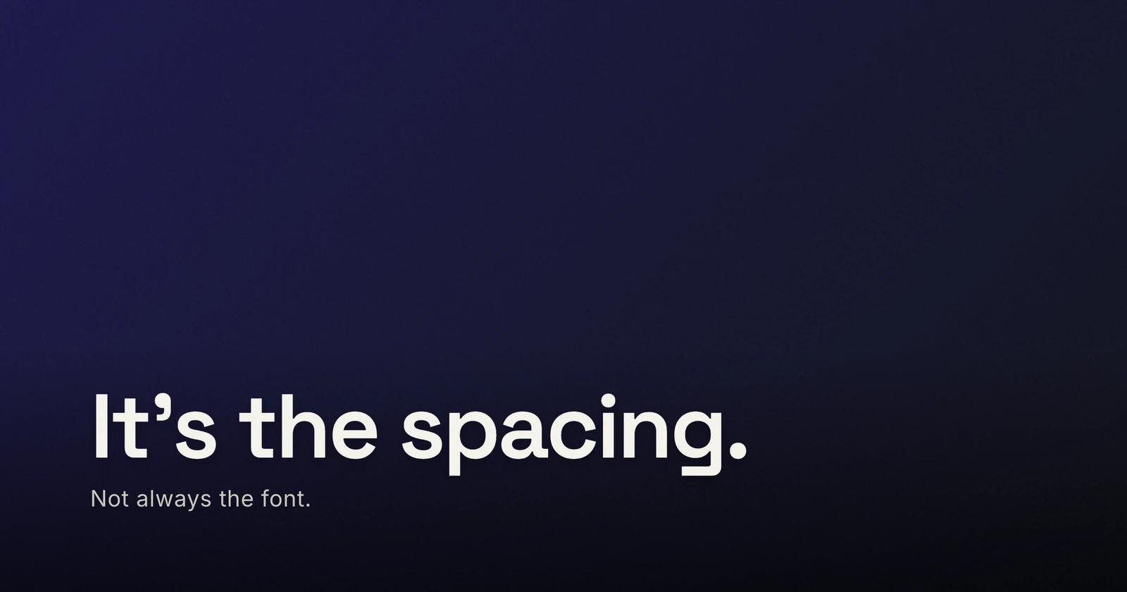
You have swapped the font three times and the cover still looks a little amateur. The font was probably fine the first time. What is off is the spacing - the gaps between letters and between lines - because most fonts ship with defaults tuned for body text, the 16-pixel paragraphs they will spend most of their lives setting. Blow one up to 100 pixels for a cover and those same defaults read loose, gappy, and unfinished. Designers call the fixes tracking and leading; on a cover you can think of them as two sliders that turn a typed headline into a set one.
Why the defaults betray you at display size
Spacing in a font is proportional: it scales with the size. Gaps that are invisible at 16 pixels become visible holes at 100 - between letters, and especially between stacked lines. That is the whole trap. Nothing broke when you sized the title up; the font is simply doing body-text spacing at billboard scale. Type set large wants to be treated differently from type set small, and the font usually cannot know which one you are doing. You have to tell it - which is why the same typeface can look default in one cover and designed in another, and why the difference between the two is rarely the font you picked.
Tracking: tighten the big, loosen the small
Tracking is the overall space between letters. The working rule for display type:
- Big type, slightly tighter. At cover sizes, pull tracking in by about 1 to 3 percent of the font size (-0.01em to -0.03em). The word stops reading as a row of letters and starts reading as one shape. The bigger the type, the more it wants.
- ALL CAPS, looser. Capitals are drawn to sit next to lowercase, so a run of them sits too tight by default. Letterspace all-caps open by roughly 5 to 12 percent - a kicker like “NEW POST” almost always needs it.
- Small type, looser. A subtitle or byline gets harder to read when tight; open it up a touch instead.
Never letterspace lowercase open for style - it falls apart fast. And skip the urge to fix spacing by faking weight or squeezing the type; if a word still looks wrong after a small tracking move, the problem is elsewhere.


Line height: stacked headlines want to be a block
Line height (leading) is the vertical distance from one line to the next, and the body-text default is the loudest tell of all. Body copy needs around 1.4 to 1.6 so paragraphs breathe. A two-line headline at 90 pixels with that default has a gulf between the lines - the title stops being one statement and becomes two strangers. Display type wants roughly 0.95 to 1.1: pull the lines together until they read as a single block, then stop just before ascenders and descenders start colliding. If a descender clips the line below, nudge it back up a step - the goal is tight, not touching. (Where the lines break matters as much as how far apart they sit, but that is its own post.)
The eye beats the ruler
Two smaller moves, same principle - the measurements lie a little, so trust your eye:
- Optical centering. A title that is mathematically centered can look off-center, because letterforms carry uneven visual weight - a “T” holds space differently than an “H”. If a centered line looks nudged, it is - rebalancing the words across lines, or dropping trailing punctuation, usually re-centers it.
- The odd pair. Some letter pairs sit awkwardly at display size even in good fonts - a “T” next to an “a”, an “r” against a “y”. At body size nobody sees it; at 100 pixels everybody feels it. If one gap in a word bothers you, a small tracking change often settles it - and if it will not settle, rewording the line is cheaper than fighting it.
None of this needs precision tools. It needs the habit of looking at the gaps instead of the letters - and shrinking the cover to a thumbnail to check the block still holds together. If the letters start fusing at that size, that is a legibility problem, not a style one - err looser.
Make it in Lede
As of v0.19.0, the Typography panel has both controls: a Spacing slider (in percent of the font size, the same unit as the numbers above) and a Line height slider, for the title and the subtitle separately. Open the editor and set your title big - it already sits at Spacing -3 and Line height 1.05, the block state this post has been arguing for. Drag Spacing up to 0 and Line height to 1.4 to see the body-text defaults you are being saved from, then bring them back and fine-tune per font and per size - a nudge either way is usually all it takes. The same two moves work on a quote card or a type-only cover, where the type carries everything.
So before you swap the font again: tighten the tracking a notch or two, pull the lines together, and look at the gaps. The font was probably not the problem. The spacing was - and now it is two sliders.