
Should Your Blog Cover Image Have Text on It?
Yes for the image readers see, no for the thumbnail Google picks.

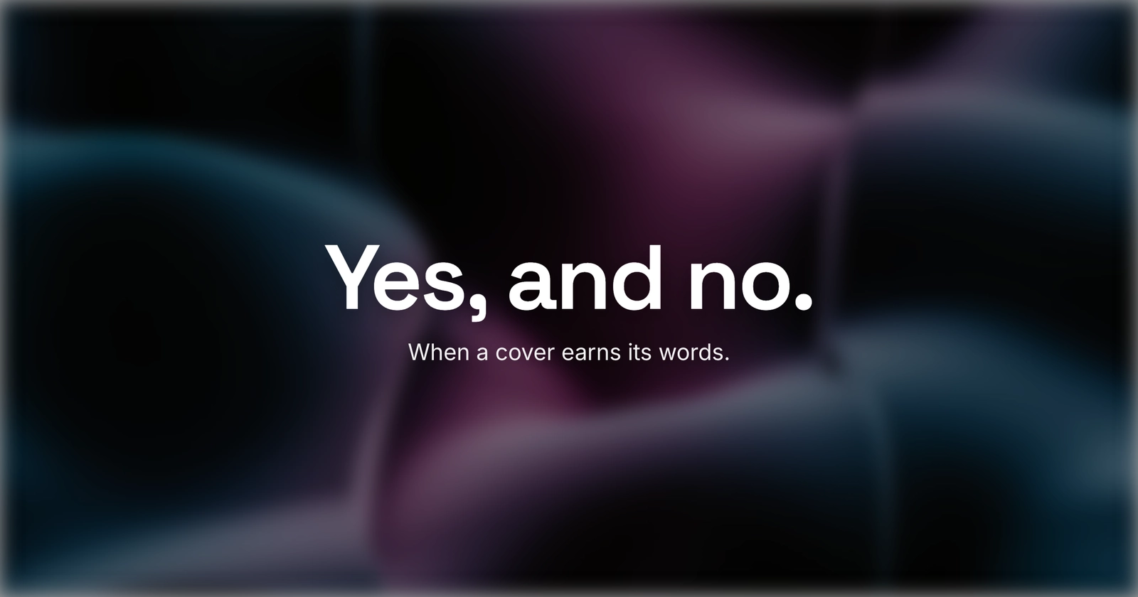
Should a blog cover have text on it? Yes for the image people see - your hero on the page and your social share card - and no for the one Google turns into a Search or Discover thumbnail. The catch is that those can be two different files. That is the whole answer; the rest is why Google draws that line, and how to keep a designed cover without giving up the thumbnail.
The question sounds like a matter of taste, a yes or no about design. It is really about the job each copy of the image does. You upload one cover, and it gets reused in four places: the top of your post, the card someone sees when they share the link, the thumbnail Google may show in Search or Discover, and the alt text a screen reader or an AI assistant reads. Same file, four jobs, and they do not all want the same thing.
What Google actually says
For years the advice “skip text on your cover” got repeated with no source behind it. Now there is one. In early March
2026, Google updated its image and Discover docs on how it picks the thumbnail next
to your result. You hand it your preferred image through either your og:image tag or your schema.org markup,
and it says to avoid text in whichever you use. The image doc is blunt: avoid “a generic image (for example, your site
logo) or an image with text” in that markup. The Discover doc echoes it, warning against “text-heavy images” in the same
place.
Read the scope carefully, because it is the whole point. Google is talking about the image it promotes to a thumbnail, the small tile in a Search result or the Discover feed. It is not banning text from every picture on your page. The reason is mechanical: Google crops and shrinks that image to fit a feed cell or a result row, and a headline you set for a wide 1200-pixel card gets sliced at the edges and squashed too small to read. Text that looked sharp in the editor turns to mush in the tile, and a busy text-on-photo thumbnail reads as clickbait.

The same file, four jobs
Here is where a cover lands, and whether text helps or hurts in each spot.
| Where the cover shows | Text on it? | Why |
|---|---|---|
| Hero on your post page | Fine | Your design surface, shown full size right next to the headline |
| Social share card (Facebook, X, LinkedIn) | Fine, often helps | Shown as-is at a fixed size with no crop, so a hook can win the click |
| Google Search or Discover thumbnail | Avoid | Google crops and shrinks it, so text gets cut and looks like spam |
| AI answers and screen readers | Invisible | They read alt text and HTML, never the pixels |
The wrinkle that trips people: most blog platforms use one field for both the hero on the page and the og:image Google reads. So a text-heavy hero silently becomes a text-heavy thumbnail, and you break Google’s rule without meaning
to. One uploaded cover, quietly doing two jobs that want opposite things.
Two images, not one
If you want a designed cover with a hook on it, and you also care about Search and Discover, the clean move is to stop
asking one file to do both. Keep the text hero for the page, and declare a separate, text-light image as your og:image and your schema primaryImageOfPage. The page gets your designed cover; Google gets a clean photo or
illustration it is happy to promote.
Not every setup lets you split them. If you only get one image field, choose by where your readers come from. Mostly Search and Discover traffic? Lean clean and let the picture carry it. Mostly shared on social? Keep the text, since those platforms show your card whole and a few words earn the tap. You are picking the slot that matters most, not following a blanket rule.
If you keep the text, commit to it
Half-hearted text is worse than none. A thin headline floating over a photo, set at a size that works on your monitor and nowhere else, is the version everyone means when they say “don’t put text on covers.” Done with intent, text earns its place.
Keep it to three to six words, the hook, not the whole headline. Set it in a heavy weight, sized for the small render, not the big one. Push the contrast until the worst pixel still passes, then check it in grayscale. Hold the words in the center safe zone, away from edges a crop will cut. You can compose all of that in Lede or any editor; the point is to design for the tile, not the canvas. If your text keeps going soft, why cover text looks blurry is usually a 1x-export problem, and keeping text readable over a photo covers the scrim and contrast work.
One more cost to pay: pixels are not words. A screen reader, and an AI assistant, cannot read the headline you baked into the art. They read the page. So repeat the message in real text: the post title, a caption, and the image’s alt attribute, which is where featured image alt text lives. Put the words in the picture for the human eye, and in the markup for everything that cannot see.
Put the words where the reader is. On the page and the share card, that is the image; in Search, Discover, and AI answers, it is the text.
A quick checklist
- Design the hero for your page with whatever text you like; it shows full size next to the headline.
- Keep the social card text short and centered, since those platforms show it whole.
- Give Google a clean, text-light image to read for the thumbnail, or expect a worse one.
- If your CMS uses one field for both, pick by your main traffic source: Discover-heavy leans clean, social-heavy keeps the text.
- Repeat any baked-in headline in the alt text, for AI answers and screen readers.
- Keep cover text to 3-6 words, heavy, high-contrast, centered in the safe zone, and grayscale-tested.
If you are still deciding what the cover should say before you decide how to say it, what makes a good blog featured image is the bigger frame, and the difference between a featured, cover, and OG image sorts out which file is doing which job. For the share-card spec behind all of this, open graph image size has the numbers.
I made the cover for this post in Lede, text and all. It is built for the feed and the share card, where a few words earn the click - and yes, that makes it a weaker Google thumbnail than a clean image would, the exact trade this post is about. When you want to make your own, open the editor and start from a gallery template. Put the words where the reader is, and let the page carry them everywhere a crop or a crawler cannot.