
Design
Composition, color, and balance for blog cover and featured images that read clearly at any size.
17 posts, page 1 of 2

It's Not Always the Font, It's the Spacing
You swapped the typeface three times and the cover still looks off. The culprit is usually the spacing - most fonts ship tuned for body text, not for type this big.
Quote Cards: Turn Your Best Lines Into Shares
Your post has one line that could travel on its own. A quote card is that line, pulled out and set as an image people actually share.

Podcast Cover Art: Sizes, Specs, and What Makes One Work
It has to clear a hard technical gate and still read at the size of a thumbnail. Get both, or your show does not list - or does not get tapped.

Make Your Blog Cover Look Made, Not AI-Generated
The anatomy tells are gone - covers read as AI now because they look generic and untouched. Looking made is about putting a human decision back in.

Grain Is a Finish, Not a Fix
Banding is noise you barely turn up until it vanishes. Grain is noise you turn up until you can feel it - a finish for flat colors and photos, now on every background.
Modern CSS Color for Blog Covers
One brand color can generate the palette, the legible headline, and the light and dark versions. Here is the modern CSS that does it, with a cover as the running example.
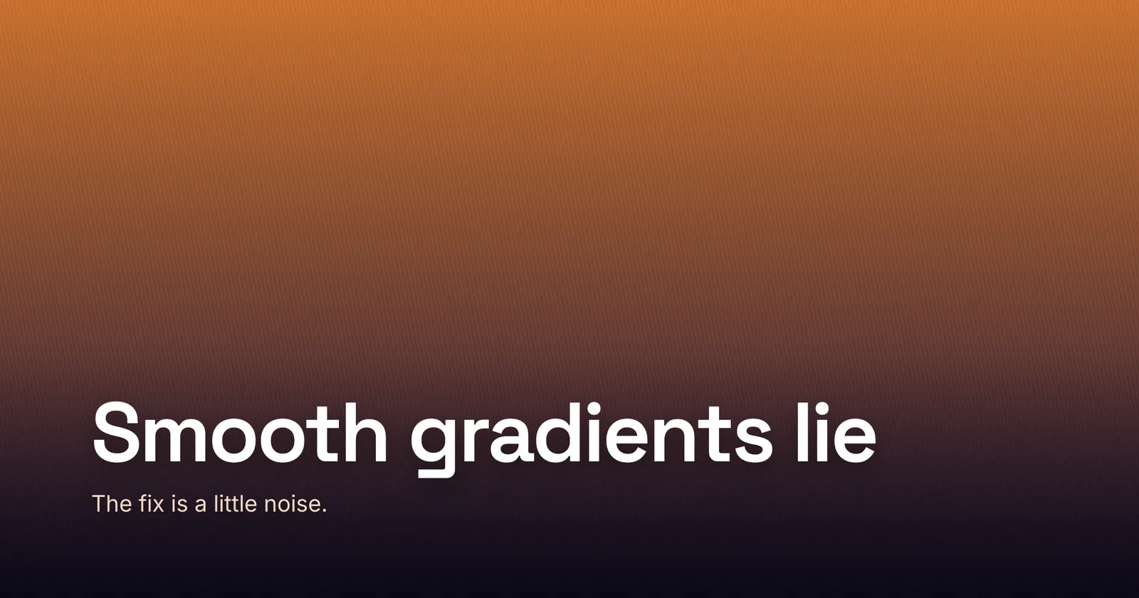
Why Gradients Band - and How Dither Fixes It
On an 8-bit screen there are only 256 steps per channel, so dark gradients break into visible bands. A little dither makes them smooth again.
Blog Cover Colors for 2026 - Six Palettes to Steal
Pantone went white, Pinterest went moody-maximalist - here are six 2026 palettes, with hex, that actually hold up on a cover.
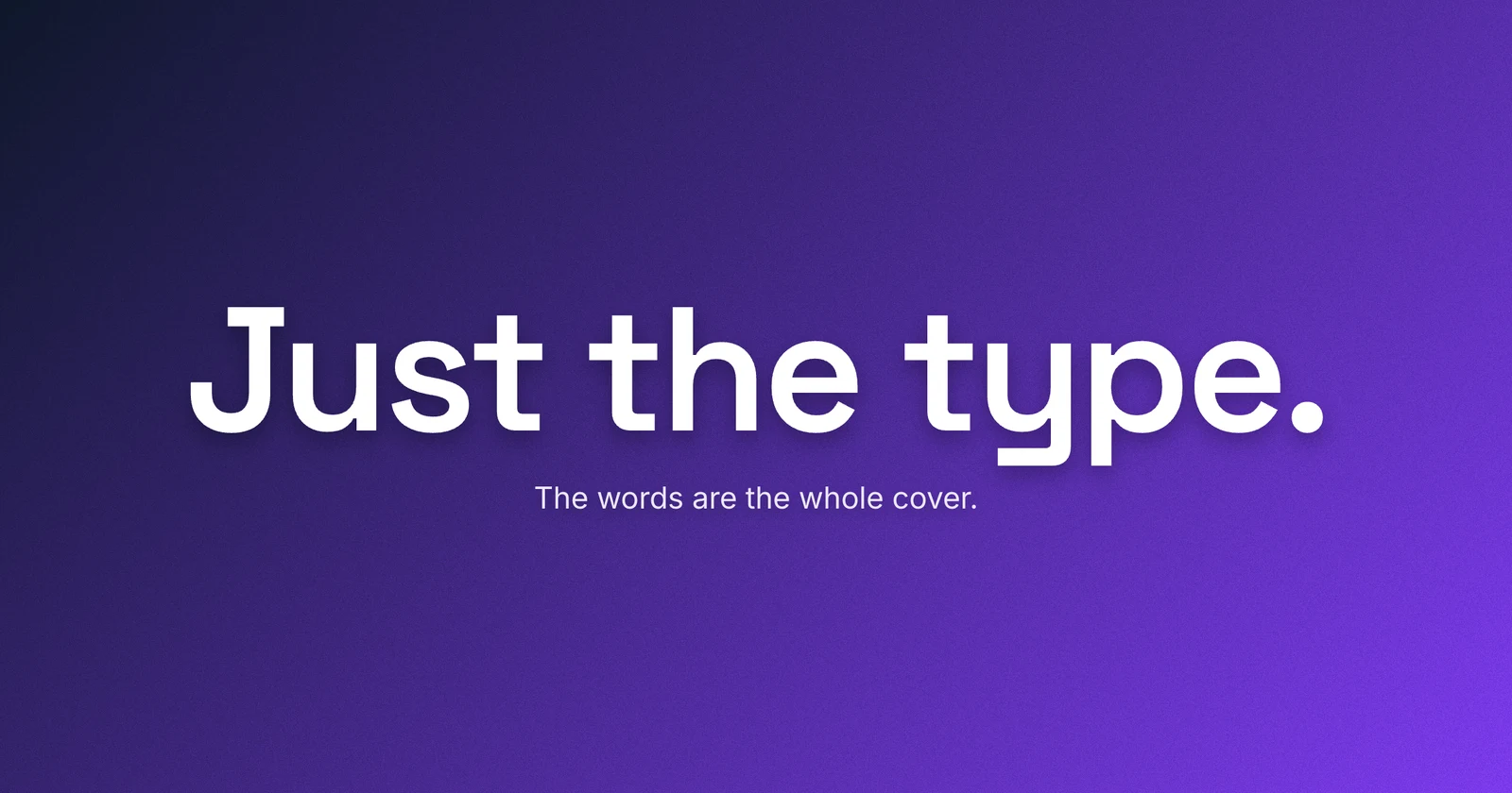
Type-Only Blog Covers: When the Words Are the Image
Drop the stock photo and let big type carry the cover - the move that reads human and holds up small.