
Why Gradients Band - and How Dither Fixes It
On an 8-bit screen there are only 256 steps per channel, so dark gradients break into visible bands. A little dither makes them smooth again.

A while back I built a cover on a plum-noir gradient - inky burgundy fading to near-black, white headline, the kind of moody background that is everywhere in 2026. It looked perfect in the editor. Exported, dropped into a feed, it had faint horizontal stripes running across the dark end, like the rings on a topographic map. The color was right. The gradient was banding.
If you have ever set a dark gradient and watched smooth color turn into stacked stripes, this is for you. Banding is not a bug in your tool or a bad export setting - it is the screen running out of numbers, and it is completely fixable once you know what it is.
Smooth color is only 256 steps
A standard screen gives each color channel 8 bits - 256 levels, from 0 to 255. Three channels together make 256 x 256 x 256, about 16.7 million colors, which sounds like plenty. The catch is that a gradient does not get to use in-between values. Every pixel has to land on one of those 256 rungs, so a “smooth” fade is really a staircase: hold a value, jump to the next, hold, jump. Colour banding is just that staircase becoming visible - a subtle form of posterization, where each pixel rounds to the nearest level it is allowed to be. It haunts the gentlest gradients - sunsets, clear skies, a dark moody cover - because that is where color creeps slowly enough for a single step to sit still and get noticed.
When the gradient has lots of contrast, the steps are tiny and close together and you never notice. Spread all 256 values of one channel across a 1920-pixel image and each step is about 7.5 pixels wide - far too fine to read as a band. The trouble starts when a gradient uses only a few of those 256 values.
Why that plum gradient fell apart
Here is the exact gradient that banded, start to end: #351E28 to #5B2230. Break it into channels and the problem
jumps out:
- Red goes from 53 to 91 - a span of 38 steps.
- Blue goes from 40 to 48 - 8 steps.
- Green goes from 30 to 34 - 4 steps.
Green moves just four times across the entire height of the cover. That is five flat plateaus stacked on top of each other with four hard edges between them. On a 630-pixel-tall cover, green holds each value for about 126 pixels before it jumps - and a 126-pixel stripe is impossible to miss. Red, crossing 38 steps, changes every 16 pixels or so, fine enough to stay invisible. The band you see is mostly green, dragging the whole color with it because green carries most of the brightness your eye reads.
That is the rule hiding inside every moody cover: a dark, low-contrast gradient bands worst, because the darker and flatter it is, the fewer code values it crosses, and the wider each flat step becomes.
Your eye makes it worse
The numbers alone undersell it, because vision is not a flat measuring stick - it actively amplifies exactly the steps a dark gradient produces. Three things pile on.
Your eye resolves shadows more finely. Perceived lightness tracks roughly the cube root of physical luminance - the CIE
formula is L* = 116 x (Y/Yn)^(1/3) - 16 - which spends far more of your discrimination on dark tones than bright ones.
A one-step jump near black reads as a bigger change than the same jump near white.
A fixed step is a bigger relative change in the dark. The Weber-Fechner law says the smallest difference you can notice is roughly proportional to the background level, so one code value against a dark field is a larger fraction of that field than the same value against a bright one. (This holds in normal screen-viewing light; it breaks down in near-darkness.) Your 8-bit values already lean on the sRGB curve, which packs more levels into the shadows for this exact reason - shadow banding is the case where even that is not quite enough.
Your eye sharpens every edge. Through lateral inhibition - first described by Ernst Mach in 1865 - the visual system boosts contrast at boundaries, making the darker side of a step look darker and the lighter side lighter. It turns a gentle one-level jump into a crisp line. Wikipedia’s own banding article notes the effect is “exaggerated by the Mach bands effect.” So the bands you see are partly real and partly drawn in by your own retina, which is why banding always looks worse than the raw numbers suggest.
The fix is a little noise
The counterintuitive cure for “not enough color steps” is to add noise. Before the gradient is rounded to 8-bit, scatter a tiny random amount into each pixel - less than one code value - so that near a boundary, some pixels round up and some round down instead of all of them flipping at the same row. The hard edge dissolves into a fine speckle, and because the dither is sub-pixel-subtle, your eye blurs it straight back into the smooth average it was always meant to be. That is dithering: trade a hard step for noise your eye cannot resolve.
The amount matters. Keep it under a single step - the rule of thumb from real rendering engines is that good dither “will never add more than +/-0.5 bits of noise”. Push past that and you have not fixed banding, you have added visible grain. The window is narrow because it does not need to be wide: human vision can read brightness steps to roughly 14 bits of precision, while the screen only outputs 8, and dither is just borrowing back the few bits in between.


Not all noise is equal
Where you put the noise decides whether it disappears or just trades one ugly pattern for another. Your eye is most sensitive to detail at middling spatial frequencies - the contrast sensitivity function is band-pass, peaking around 4 cycles per degree and falling off to near nothing by about 60 - so the trick is to keep the dither’s energy up at high frequencies where you cannot see it. Lede gives you four noise types, and they sit at different points on that curve:
- Blue is the clean default. It is high-frequency noise by construction, so its energy lands exactly where your eye is least sensitive - it kills bands without ever reading as grain. (The name comes from Robert Ulichney’s 1988 paper “Dithering with Blue Noise,” still the reference.) Reach for this first.
- Fine is the subtle, small-scale everyday setting - the other “just smooth the gradient” option alongside blue.
- Grain is white noise. It works, but white noise carries low-frequency energy your eye can see, so it clumps and reads as texture. Use it when you actually want a film-grain look, not as the invisible band-killer. Since v0.18.0 the noise control runs on any background, not just gradients, so grain as a finish on photos and flat covers is its own move.
- Pixel is an ordered, fixed pattern. It is efficient, but the regular grid is easy to spot as a faint cross-hatch - save it for a deliberate retro or pixel-art feel, not a clean cover.
For a smooth dark cover, blue or fine. For a mood, grain. That is the whole decision.
Watch the export
You can still throw all of this away at the last step. Dither is a fine, high-frequency signal, and high-frequency detail is the first thing lossy compression discards. Save a perfectly dithered cover as a heavy JPEG, or push the WebP quality slider too low, and the encoder can smear the dither away and hand your bands right back. If you dither and the banding returns after export, raise the quality and look again - it is worth understanding how each format treats a gradient before you compress the file. (On a live web page you can sidestep this entirely by overlaying an SVG noise filter on a CSS gradient, so the dither stays procedural and never gets compressed - but for an exported cover image, quality is the lever.)
Make it smooth in Lede
You do not have to think about any of this while you work. Open the editor, set a gradient background, and if the dark end looks striped, turn on noise, choose blue or fine, and nudge the amount up until the bands let go. It is the same control that keeps a flat color from looking like a default background - a touch of the right noise is the difference between a gradient that bands and one that just looks smooth.
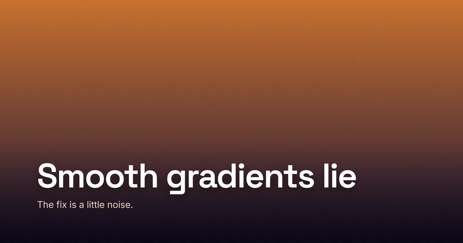
The cover for this post is that fix doing its quiet job: a sunset gradient - the textbook banding case - held perfectly smooth by a touch of blue noise. Smooth color is a lie your screen tells in 256 steps. Dither is how you make the lie convincing.