
Modern CSS Color for Blog Covers
One brand color can generate the palette, the legible headline, and the light and dark versions. Here is the modern CSS that does it, with a cover as the running example.

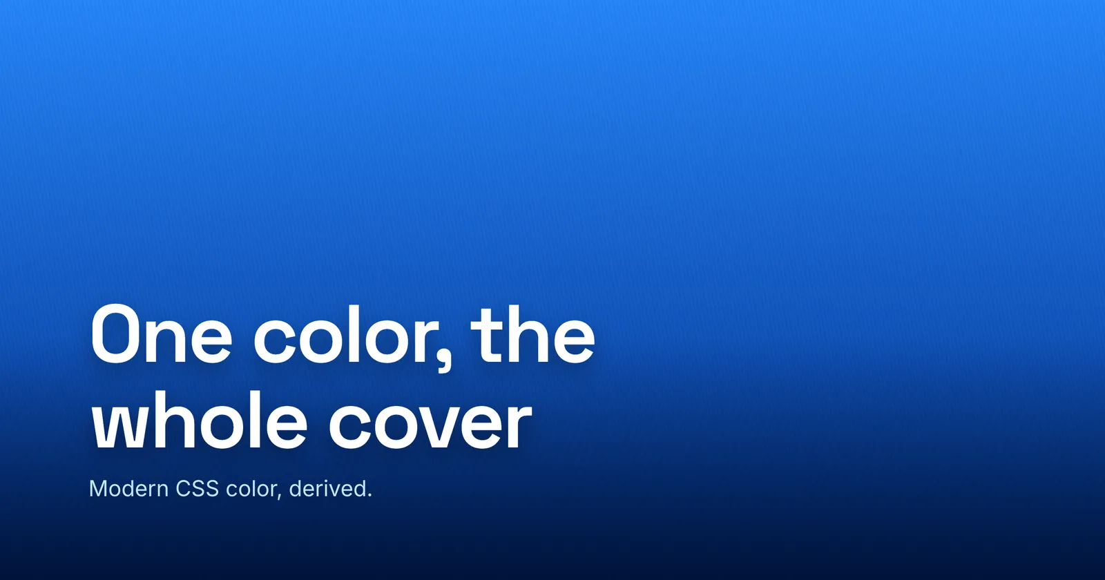
A blog cover is a tiny design system. You pick one color, and everything else should follow from it: the dark end of the gradient, the muted subtitle, the accent, and a headline color that stays readable. For years, “follow from it” meant hand-nudging hex values until they looked right, then doing it again for the dark-mode version. In 2026, modern CSS color derives the rest for you - from a single variable, with the math built into the language.
This is a tour of that toolkit - OKLCH, relative color syntax, color-mix(), contrast-color(), and light-dark() -
with a cover as the running example. If you build covers in code, it is a small revelation. If you do not, Lede does all of this for you without a stylesheet - but it is worth seeing why the picks work.
Why OKLCH, not HSL
Start with how you name the color, because the old way quietly sabotages everything built on top of it. In HSL, lightness is a lie. Add ten percent lightness to a blue and to a purple and they do not move by the same perceived amount; rotate the hue and the lightness shifts under you, which is a classic way to make text that was readable suddenly fail. HSL is easy to type and impossible to reason about.
OKLCH fixes the part that matters: L is perceptual lightness. A color is three numbers - L (lightness, 0 to 1), C (chroma, from 0 up to about 0.37 for colors a screen can show), and H (hue, 0 to 360).
--brand: oklch(0.62 0.19 256); /* a confident blue */Because L tracks what your eye actually reads, a band that is “10% lighter” looks 10% lighter no matter the hue. That
single property - predictable lightness - is what makes every move below reliable. oklch() itself has been Baseline Widely available since May 2023, so
you can use it unguarded.
One honest caveat up front: perceptual lightness is not a contrast measurement. Two colors can share an L and still
be illegible together. OKLCH keeps contrast predictable when you transform a color; it does not certify it. Hold that
thought - it is the whole reason the headline section exists.

Derive the palette from one --brand
Here is the move that replaces a folder of swatches. Relative color syntax - oklch(from <color> L C H) - pulls a
color apart into its channels, lets you do math on them, and hands back a new color. Point it at one --brand and spin
out the entire cover palette, every step locked to the same hue.
:root {
  --brand: oklch(0.62 0.19 256);

  /* Tints: raise L, and ease off chroma so pale steps don't go radioactive. */
  --brand-100: oklch(from var(--brand) calc(l + 0.30) calc(c * 0.45) h);
  --brand-300: oklch(from var(--brand) calc(l + 0.16) calc(c * 0.70) h);

  /* Shades: lower L, hold hue. The deepest is your matching dark gradient stop. */
  --brand-700: oklch(from var(--brand) calc(l - 0.15) c h);
  --brand-900: oklch(from var(--brand) calc(l - 0.28) calc(c * 0.90) h);

  /* Accent: rotate the hue half a turn, keep L and C. */
  --accent: oklch(from var(--brand) l c calc(h + 180));
}

.cover {
  background: linear-gradient(135deg, var(--brand), var(--brand-900));
}
Inside oklch(from ...), the channel keywords become plain numbers: l runs 0 to 1 (so calc(l + 0.2) is right
and calc(l + 20%) is an invalid color), and h is a unitless degree, so calc(h + 180) rotates the hue with no deg.
Two gotchas worth internalizing: raising L while keeping full chroma makes pale tints look neon, which is why the tints
above multiply c down as they lighten; and chroma past the displayable gamut just gets clamped, so a bigger c will
not always look more saturated.
The cover-specific payoff is the matching dark stop. Drop L, hold the hue, and your gradient deepens into the same
color instead of drifting toward a muddy neutral - exactly the dark end a white headline wants to sit on. Relative color
syntax is newer than plain oklch(): Baseline Newly available since September 2024 (about
86% of browsers), so wrap derived values in a fallback.
@supports not (color: oklch(from white l c h)) {
  :root { --brand-900: oklch(0.34 0.12 256); }
}
Blend surfaces and scrims with color-mix()
Sometimes you do not want a relative of the brand color, you want it mixed with another. color-mix() does that, and the
one thing to get right is the interpolation space, which is mandatory and decides the whole result:
/* A scrim to keep a headline readable over a photo. */
background: color-mix(in srgb, black 60%, transparent);   /* = rgba(0, 0, 0, 0.6) */

/* A tint that stays vivid through the middle instead of graying out. */
border-color: color-mix(in oklch, var(--brand), white 35%);
Mixing in srgb is fine for a plain dark scrim, but between two distant hues an sRGB blend can pass through a dull,
desaturated middle. in oklch (or in oklab) keeps the midpoint perceptually even. This is the same reason a long
two-color gradient can dull through gray - the cousin problem to gradient banding, and the
spot where reaching for a perceptual space pays off. color-mix() is Widely available (since May 2023, roughly 90% of
browsers), so it needs no guard.

Backstop a legible headline with contrast-color()
Now collect on that earlier warning. You derived a palette, so the cover background can be any tint - and a derived tint
can quietly fall into the mid-tones where white-on-it and black-on-it are both marginal. contrast-color() settles it in
one line:
.cover {
  --bg: var(--brand);
  background: var(--bg);

  color: white;                     /* static fallback FIRST */
  color: contrast-color(var(--bg)); /* black or white, whichever is more legible */
}
Be clear-eyed about what it promises. It returns only black or white (ties go to white) and judges with WCAG 2’s
4.5:1 ratio, not a perceptual model. On a mid-tone it can still pick wrong - MDN’s own example is royal blue #2277d3,
where contrast-color() returns black text that is “not readable for small text.” It is a genuinely useful no-build
safety net; it is not a guarantee your headline is comfortable.
That mid-tone gap is exactly where keeping text readable gets real, and
where Lede picks up the same job with a stricter tool. Lede scores every text-over-background pairing with APCA - the contrast model behind the WCAG 3 drafts - and holds a headline to a
target lightness contrast rather than a flat ratio. APCA models perceived lightness far better in precisely these
mid-tone and colored-text cases, and it can point you at a tuned color instead of only black or white. Think of it as a
sharper test sitting above contrast-color()’s WCAG 2 floor, not a replacement for a handy primitive. contrast-color() is the newest feature here - Baseline Newly available since April 2026, around 74% of browsers - so the static fallback
is not optional.
Ship light and dark in one line
A reader on a dark interface and a reader on a light one should both get a cover that fits. light-dark() ships both
from a single declaration, no media query:
:root {
  color-scheme: light dark; /* light-dark() is inert without this */
}

.cover {
  background: light-dark(var(--brand-100), var(--brand-900));
  color: light-dark(oklch(0.20 0.03 256), oklch(0.96 0.02 256));
}
The catch is the dependency: light-dark() does nothing until color-scheme is set, and it never reads prefers-color-scheme itself - color-scheme is the switch that lets the operating-system preference through. Set it
once on :root (it inherits), and add <meta name="color-scheme" content="light dark"> to the <head> so the page
does not flash the wrong scheme before CSS loads. It is Baseline Newly available (since May 2024, ~85%), and goes Widely
available in November 2026.
And here is the caveat that matters most for covers: light-dark() only works while the cover is live CSS. The
moment you export a PNG, WebP, or JPEG, the file is frozen at whichever scheme was active - a raster cannot carry both.
That is not a flaw, it is what a portable image is. For an exported cover or an OG card that has to work in light and
dark, the answer is to export both versions, not to chase a function the
format cannot hold.
When the system is overkill
Two more features round out the toolkit, mostly worth knowing so you can spot when not to reach for them. Register a color as a typed custom property and it can animate; leave it unregistered and a transition snaps at the midpoint instead of fading:
@property --cover-bg {
  syntax: "<color>";
  inherits: true;
  initial-value: oklch(0.62 0.19 256);
}
Pair that with @container style() - style queries that branch on a custom property’s value - and you have real theming
infrastructure: one cover component, many brands, switched by a single variable, even storing a contrast-color() result
and reading it back to branch on the chosen ink. Una Kravets’ walkthrough of modern CSS
theming builds the whole system end to end and is the reference to keep open for it.
Both are still Baseline Newly available - @property since July 2024, style queries since May 2026 - but it is machinery
for a fleet of live covers, not the one you need to ship today. For a single export, skip it.
The no-code path
Everything above is the same handful of decisions Lede makes for you: a palette derived around one
color in even perceptual steps, a gradient that deepens on-hue, an APCA-checked
headline color, and a grain that keeps the gradient smooth - no @supports, no fallbacks,
no registering anything. The CSS is worth learning because it makes visible why a good cover’s colors hang together:
one hue, predictable lightness, contrast you can trust.
So pick your brand color and open the editor. Whether you derive the rest in a stylesheet or let Lede do it, the principle is the same - one color, and the cover follows.