Typography
Choosing and setting type for cover images - pairings and sizes that stay legible down to a thumbnail.
6 posts, page 1 of 1
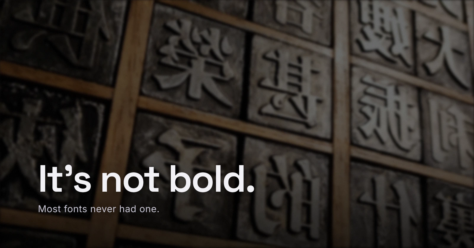
The Bold Button Is Faking It
Ask a font for a bold weight it never shipped, and the browser fakes one rather than refuse. What synthetic bold actually does to your letterforms, and the CSS line that catches it before export.
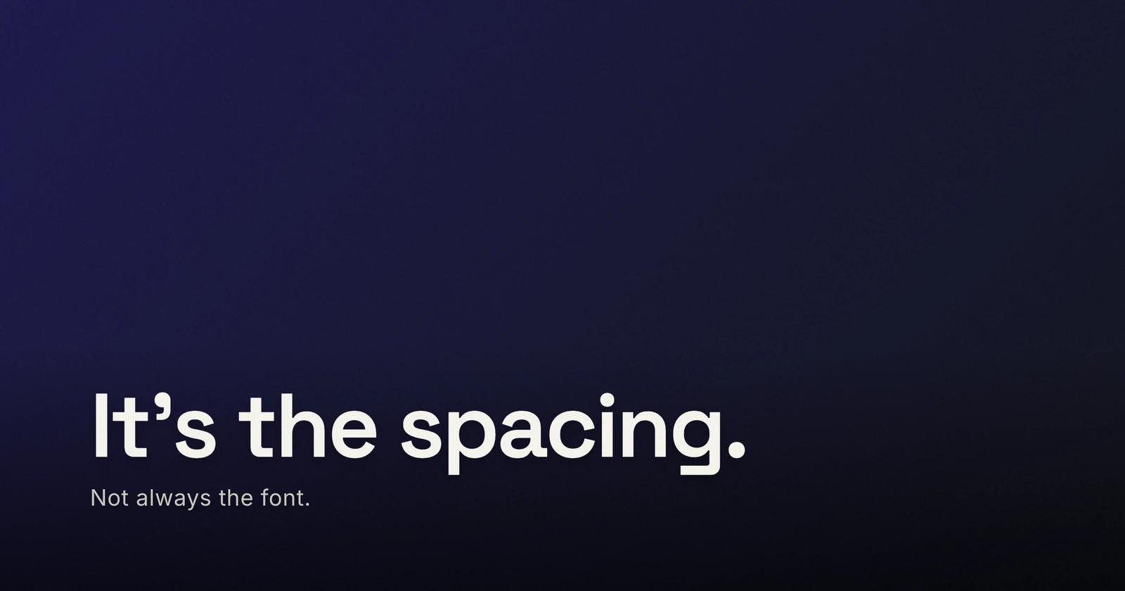
It's Not Always the Font, It's the Spacing
You swapped the typeface three times and the cover still looks off. The culprit is usually the spacing - most fonts ship tuned for body text, not for type this big.
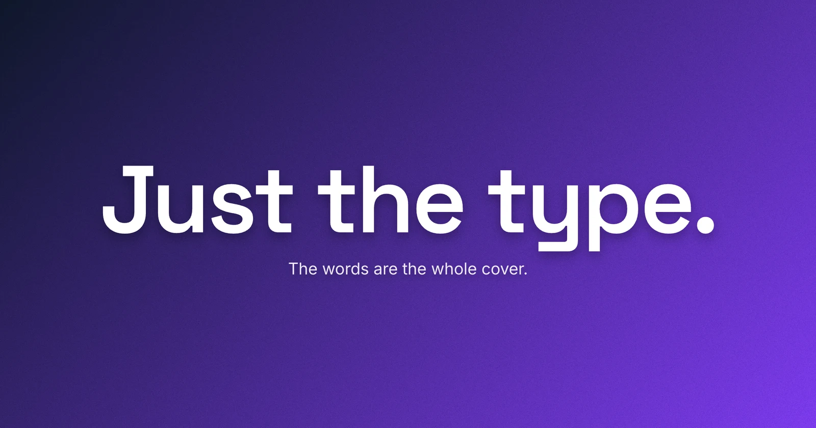
Type-Only Blog Covers: When the Words Are the Image
Drop the stock photo and let big type carry the cover - the move that reads human and holds up small.
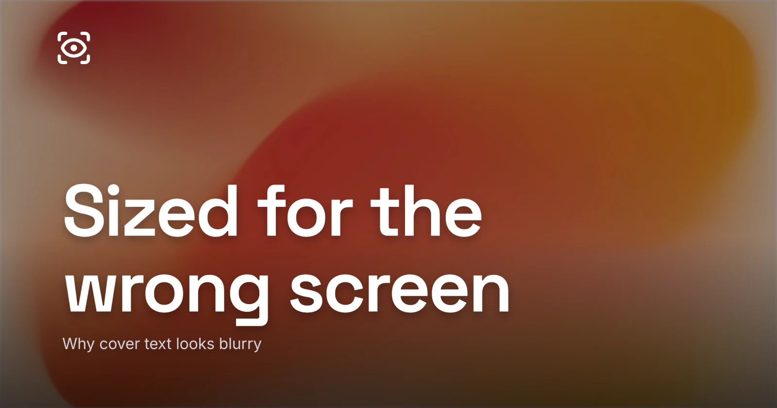
Why Your Cover Text Looks Blurry
The four real reasons cover type goes soft, and the fix for each one.
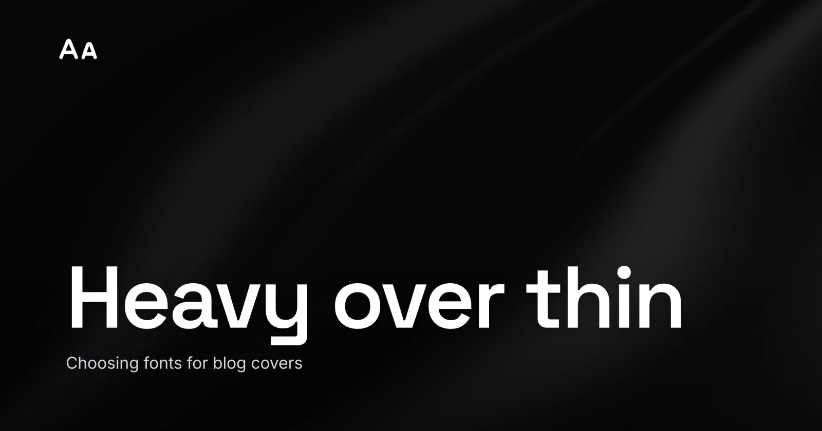
Choosing Fonts for Blog Covers
Type that still reads at thumbnail size - heavy weight, a screen sans, sized small, one display face.
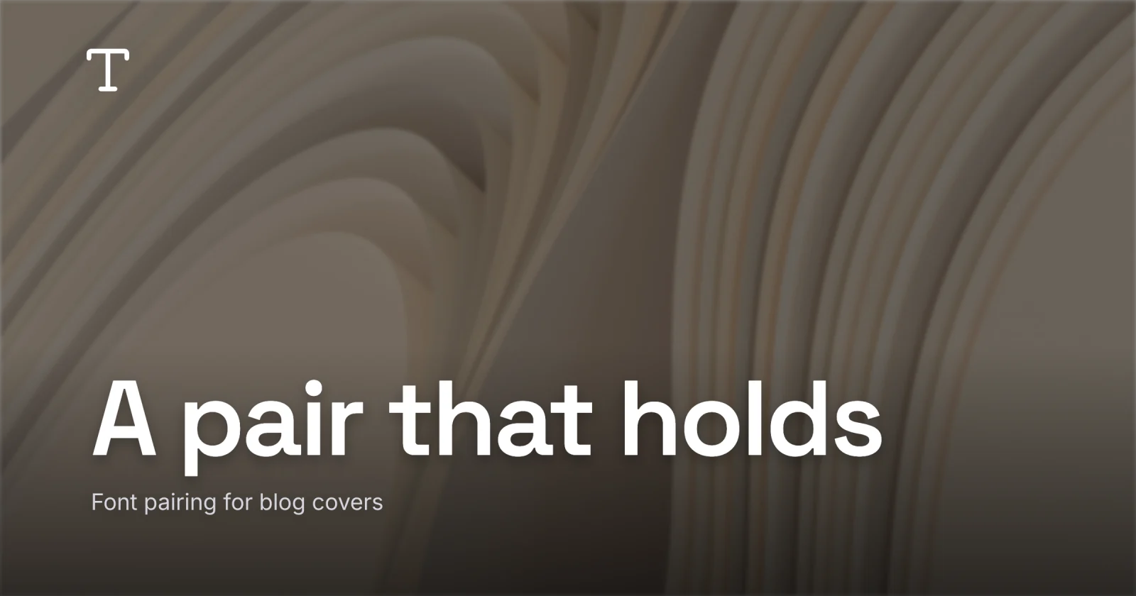
Font Pairing for Blog Covers - One Display, One Workhorse
When one face is enough, and how to pair two so they read as design.