AI-Generated vs Stock vs Custom Cover Images
The honest tradeoffs between AI art, stock photos, and a custom typographic cover.
You have three ways to source a blog cover - generate it with an AI tool, pull a stock photo, or build a custom typographic cover where type does the work - and people agonize over the first two while the third quietly wins most of the time. For the vast majority of blog posts, a custom typographic cover beats both AI art and stock, because the layout and the title carry the meaning and the photo is only a backdrop. That is the whole answer; the rest is the tradeoffs, and the handful of cases where AI or stock is genuinely the right call.
The reason this question feels hard is that it gets framed backwards. People treat the image as the cover and the text as a label stuck on top. Flip it. The headline is the cover, and the background - whatever its source - is there to sit quietly behind a heavy title that reads at the size of a thumbnail. Once you see it that way, the AI-vs-stock debate shrinks to a much smaller question: what fills the space behind the words.
The three sources, side by side
Here is the honest scorecard. Each source wins something and loses something, and the row that matters most for a blog is the last one.
| Source | Cost / time | Sameness risk | Licensing + disclosure | Survives the thumbnail |
|---|---|---|---|---|
| AI-generated | Cheap, a few minutes | High - one house style | Terms shift; may need a label | Poor alone; fine as a backdrop |
| Stock photo | Free to paid, fast | High - everyone uses it | Per-license; attribution varies | Decent if you crop and scrim |
| Custom typographic | Free, a few minutes | Low - it is yours | None - you made it | Best - type is built to read small |
The thing the table makes obvious: the custom typographic cover is the cheapest, the most distinct, the cleanest on licensing, and the one most likely to read in a feed. It loses on exactly one front - it does not give you a rich photographic scene - and most blog posts do not need one.

What AI-generated images are actually good at
AI image tools earn their place as a backdrop generator, not a cover-maker. Ask for an abstract gradient mesh, a soft grain texture, a moody field of color, or a loose geometric pattern, and you will get something usable in under a minute that you can drop a title over. For that job - the quiet thing behind the words - AI is genuinely useful and nearly free.
Where it falls down is anything a reader inspects up close. Faces drift into the uncanny. Hands come out wrong. Text inside the image renders as gibberish. A “real” product or screenshot looks plausible until you look twice and the details dissolve. So the moment your cover wants a believable scene of a real thing, AI is the weak choice, and the moment it wants only a wash of color behind a headline, AI is fine.
Two cautions before you lean on it. First, sameness. Most AI tools have a recognizable house look, and a blog whose covers all share that synthetic gloss starts to read as a content farm - dodging that is the craft of making a cover look made, not generated. Second, the terms move. The commercial-use, ownership, and attribution rules for AI image tools change often, so read the current license before you publish anything you generated, and never assume last year’s terms still hold.
What stock photos are good at, and where they bite
Stock is the right call when you need a believable real scene and you do not have the photo yourself - a city skyline, a coffee shop, a person working, a landscape. A good stock library gives you those in seconds, often free, in a quality AI cannot fake.
The catch is that everyone else has the same library. The popular shots get used to death, so a reader who reads a lot of blogs has seen your “diverse team smiling at a laptop” a hundred times, and a generic stock photo reads as a placeholder rather than a choice. The fix is to pick the unobvious frame, crop in tight on one subject, and treat the photo as raw material you compose on rather than a finished cover you caption.
Stock also comes with real licensing homework. Free is not the same as unrestricted - some licenses ask for attribution, some bar certain commercial uses, and the terms differ from one library to the next. Read the license for the specific image, keep the credit line your source asks for, and you stay clean. For where to find well-licensed free photos, start from the libraries that spell out their terms up front. If you do go the photo route, keeping text readable over that photo is the part that decides whether the cover works.
Why the custom typographic cover wins most of the time
Strip a great blog cover down and the photo is rarely the reason it works. The title carries the post, and type is the one element built from the ground up to stay legible when it shrinks. A heavy headline on a clean gradient reads at 200px wide where a detailed photo has already turned to mush. That is the entire game in a feed, and it is why a typographic cover beats a busier one more often than people expect.
It also wins on the three things the table flagged. It is yours, so there is no sameness risk and no license to read. It is the fastest to make once you have a layout, because the next cover is just a swap of the title. And it sidesteps the whole question of disclosure, because no reader mistakes a bold line of type on a color field for a documentary photograph.
Photos still earn their place - just be clear about the job. AI or stock, the photo is the backdrop; the layout and the headline on top are what earn the click - which is the craft covered in what makes a good blog featured image, and the patterns worth reusing in blog cover examples worth stealing.
A simple rule for which source to reach for
You do not need to relitigate this every post. One decision tree covers almost every case:
- Does the post need a believable real scene a reader will look at closely - a place, a person, a product? Reach for a stock photo (or your own), crop it tight, and scrim the type. This is the minority of posts.
- Does the post just need a backdrop behind a strong headline? Build a custom typographic cover on a gradient or flat color. AI is fine here too if you only want an abstract texture to fill the space - treat what it makes as the backdrop and let your headline stay the cover.
- When in doubt, default to type. A headline on a clean background is the safest, fastest, most distinct cover you can ship, and it reads small better than anything else.
Whatever you pick, export it sharp. A cover lives most of its life as a share card, so build at the standard 1200×630 and export at 2x for retina screens - the format and compression side lives in WebP vs JPG vs PNG for blog images.
A quick checklist before you commit to a source
- Ask first: does this post need a real scene, or just a backdrop? That single question picks the source.
- If AI, use it for an abstract texture or backdrop only - never faces, hands, text, or a “real” product.
- If stock, crop tight on one subject and read the specific image’s license before you publish.
- For everything else, default to a custom typographic cover - it is yours, it is fast, and it reads smallest.
- Whatever the background, the heavy title does the work; tune the scrim to the worst pixel under the text.
- Confirm the cover reads when shrunk to ~10 percent, then export at 1200×630, 2x.
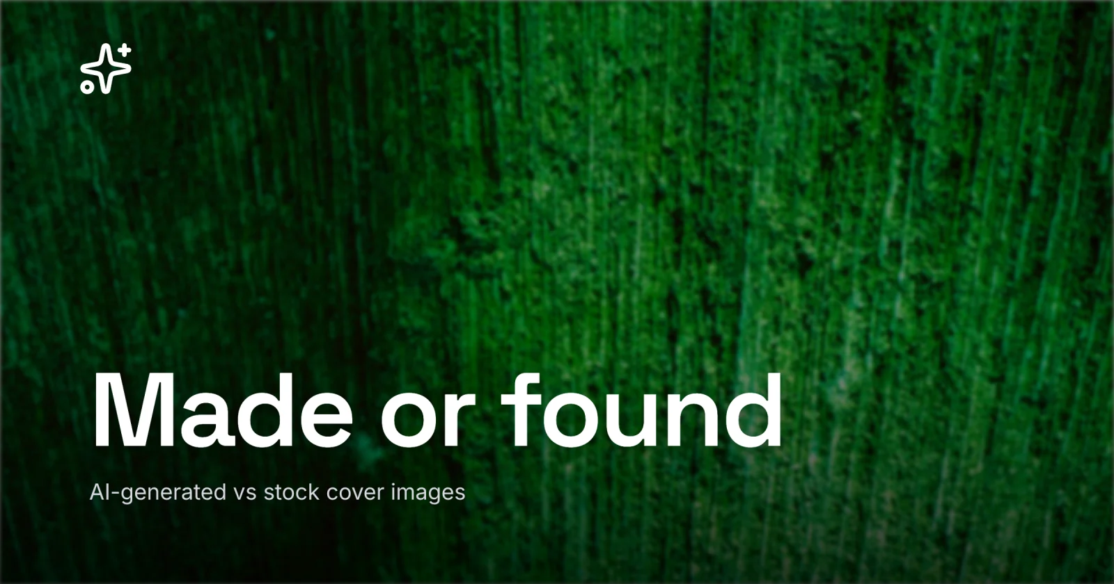
The cover for this post is the rule in action: no photo at all, just a heavy line of type on a gradient, made in Lede. When you want to build one the same way, open the editor - it is built for type-on-gradient covers with no photo at all, and the gallery of templates is a rack of typographic starts you can drop your own title into and ship.