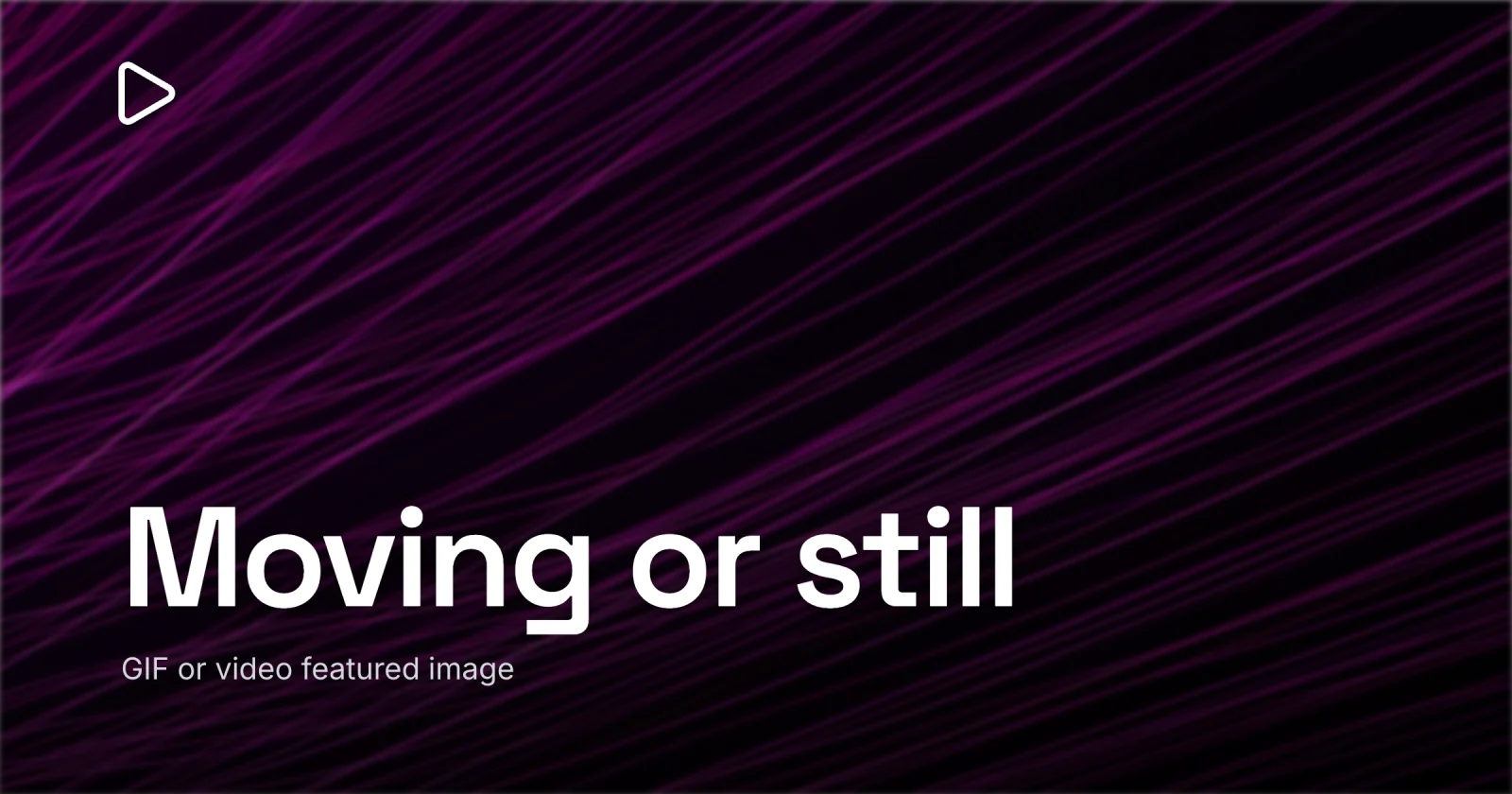
Can You Use a GIF or Video as a Featured Image?
Motion can play on the page, but the link card and most thumbnails fall back to a still.
You can put an animated GIF in the featured-image slot and many themes will play it - but the link preview and most of your archive thumbnails will quietly show a single frame instead. A video does not go in the slot at all. So design a strong static cover at 1200×630 first, and treat any motion as a bonus that only some readers will ever see. That is the whole answer; the rest is why the motion drops out, and where a short clip actually belongs.
The reason this question comes up is that motion grabs the eye, and a feed full of still cards is begging for something that moves. The instinct is right. The problem is that the one file standing in for your post gets read by a dozen systems that freeze it to a still before a reader ever sees it.
Where the motion drops out
A featured image is one asset rendered in a lot of places, and only one of them - the page itself - can play motion at all. Everything else freezes it. The share card is the clearest case: when someone pastes your link, the platform reads the og:image tag, and that tag points at a static picture. There is no og:gif, no og:video that any normal blog wires up for a link card. Slack, LinkedIn, Discord, and X all render a still. If you handed them a GIF, they grab the first frame and show that.
Here is the same featured image, the same one file, and what each context actually does with motion:
| Where it shows up | Plays motion? | What a reader sees |
|---|---|---|
| In-article hero (on page) | Sometimes - GIF can play | the animation, if the theme plays it |
| Mobile feed / archive grid | Usually not | a single static frame |
| Social / link preview | No | the og:image still |
| RSS reader / email | Rarely | a frozen frame or nothing |
Read it top to bottom and the rule writes itself: the only place motion has a chance is the live page, and even there it depends on the theme. Every render that travels - the share card, the feed tile, the email digest - lands on a still. So the still is the asset. If it is weak, the cover is weak everywhere it counts, animation or not.

A GIF on the page costs you real bytes
Say your theme does play the GIF in the hero slot. You still have a second problem, and it is page speed.
GIF is an ancient format. It tops out at 256 colors, it has no real video compression, and a few seconds of full-frame animation routinely weighs several megabytes - often more than every other asset on the page combined. A single static cover, exported the right way, lands a sharp 1200×630 card comfortably under 150 KB. The GIF version of that same cover can be twenty or fifty times heavier. That weight hits your largest-contentful-paint, your mobile load time, and the page-speed score that actually feeds into how the post ranks.
If you want motion in the body of the article - a product demo, a UI walkthrough, a loop that shows a thing happening - reach for a short muted video over a GIF. A 5-second MP4 or WebM of the same clip is a fraction of the size and far smoother. That is body content with its own player, though. It stays out of the featured slot.
What still images you actually need
The static cover is the thing nearly every reader actually meets, so it earns the attention. The good news: the rules for a still cover are settled, and they are the same whether or not you ever add motion.
You need one well-made static image, and you need it at the right shape. One file at 1200×630 (a 1.91:1 ratio) covers the share card on Facebook, LinkedIn, X, Slack, and Discord, and a 16:9 hero scaled from it still looks right at the top of the post. The size each render expects goes through the exact pixel targets, including why a centered subject survives X’s center-crop and why you export at 2× for retina screens.
For the design itself - one subject, real contrast, type heavy enough to read at thumbnail scale - the craft lives in what makes a good blog featured image. Get that still right and you have covered every place the cover appears. The motion, if you add it, is icing on a cake that already has to stand alone.
The frame trap: design the still, then animate it
Here is the mistake I see most. Someone builds a slick animation, exports it as a GIF, and never looks at the first frame. Then the share card pulls that first frame - and it is a blank intro slate, a mid-transition smear, or the logo before it has finished sliding in. The cover that travels to every feed and every link is the weakest single frame of the whole loop.


If you do ship a GIF, work backwards. Design the static 1200×630 cover first, make it the opening and closing frame of the animation, and let the motion happen in between. That way the frame every scraper grabs is the one you actually composed. And keep a separate, clean still on hand as your declared og:image, so the link preview never depends on whatever the GIF decides to freeze on.
The simpler path, and the one I reach for: ship the strong static cover, and put any motion in the article body as a short muted clip where you control the player and the weight. The representative image stays a still. It is lighter, it reads everywhere, and you skip the frame trap entirely.
A quick checklist
- Make the cover that travels a static image at 1200×630, 1.91:1, and point
og:imageat it. - Assume the share card, feed tiles, and email digests show one frame, never motion.
- If you ship a GIF on the page, make the still cover its first and last frame so the grabbed frame is the one you designed.
- Keep a heavy GIF out of the featured slot - a few seconds can run several MB and drag your load time.
- Put real motion in the article body as a short muted MP4 or WebM, not in the featured slot.
- For the right pixels and the right format of the still, size it correctly and pick the format.
Motion is fun, but it does not travel. The one file that represents your post is met as a still in every place that matters, so the still is where the work goes. If the words “featured,” “cover,” and “OG” still blur, what each one means sorts them out.
When you want to build that static cover, open Lede - it has a 1200×630 preset, a gallery of templates to start from, and a one-click 2× WebP export. Make the still strong, and let any motion be the bonus on top.